Think of your favorite YouTube channels. What do they all have in common?
(Well, aside from a ton of subscribers.)
I’ll give you a hint: they probably all have a custom, high-quality YouTube banner on their profiles. One look and you have a sense of what their channels will offer you.
Consistent and recognizable visual branding is essential for growing your YouTube following.
If you’re a content marketer, odds are you’ll recognize Brian Dean’s Backlinko green when you see it:
That’s because he uses this shade of green in his site banner as well. That anyone finding his content via YouTube first, or via his blog posts first, will recognize his branding when they come across more content by him.
There’s also the matter of making your channel look legitimate. Just like with website design, blog design and social media profiles, your YouTube channel design is the packaging for the content you’re trying to “sell”.
But if you’re a smaller business, or just one person trying to get your channel off the ground, then odds are you don’t have the budget to hire a designers for your visual branding.
That’s why you can save a lot of money and stress by creating your own YouTube banner.
When in doubt, start with a YouTube banner template
If you don’t have much design experience, the idea of designing your own YouTube banner from scratch might seem a bit daunting.
That’s why, before we dive into tips for how you can create your own creative YouTube banner, I want to suggest a shortcut:
Save yourself the stress by using a YouTube banner template as the foundation for your design.
A template will guide your design, while also ensuring that your banner uses the correct dimensions. The recommended YouTube banner dimensions are 2560 x 1440 pixels. So you need to use your space wisely.
Not sure where to start? Don’t worry.
This guide will offer you some helpful tips for designing your own YouTube banner, starting with a YouTube banner template.
1. Pick a YouTube banner layout that fits your vision
When it comes to selecting a YouTube banner template, look for a layout that works for you. Think about where you want the focus of your banner to be, and the effect that you want it to have.
There are a few basic banner layouts you can start with.
Centered title layout
Placing your title in the center of your banner puts the emphasis on the font. The symmetrical layout will make your title look bold and focused.
Asymmetrical layout
An asymmetrical layout can look more casual and playful. Typically, you would place your title to one side of the banner and balance it out with a picture on the other side.
Sectioned layout
If you want to incorporate multiple images into your banner, you can do so by dividing your banner into sections. To prevent your banner from looking cluttered, make sure that the sections are even widths.
2. Offer a window into what viewers can expect from your channel
Odds are, someone has landed on your channel one of two ways: they either watched a video of your and wanted more, or someone linked them to your channel.
Your banner can indicate to visitors whether or not your channel will offer them more of what they’re interested in. That means that the style, tagline and images you include should give people a bite-sized view of what your channel is all about.
For example, say you’re a travel vlogger. Your YouTube banner should indicate to visitors that they can expect more adventures from you:
3. Include your brand tagline or slogan
What’s your channel’s elevator pitch? What’s your core value proposition? Include your catchy tagline in your YouTube banner.
Typically, YouTubers will put their tagline along the top or bottom of their banners. For example, this YouTube banner template for an anime review channel lists the topics covered in their videos along the bottom:
To avoid cluttering up your banner design, keep your tagline to one sentence.
Another option is to simply include your website url in your banner. That will also help spread awareness about your brand.
4. Keep your YouTube banner design simple
There isn’t a lot of space to pack too many design elements into your YouTube banner. That’s why it’s good practice to keep your YouTube banner design simple.
For example, simply use a photo as the background of your banner, with your title and nothing else. Like in this YouTube banner template:
You can help text pop from the background by creating a transparent overlay. Place your text on top of a square icon and then adjust the icon’s opacity so that the background image shows through.
Now you can read the text without obscuring the background image!
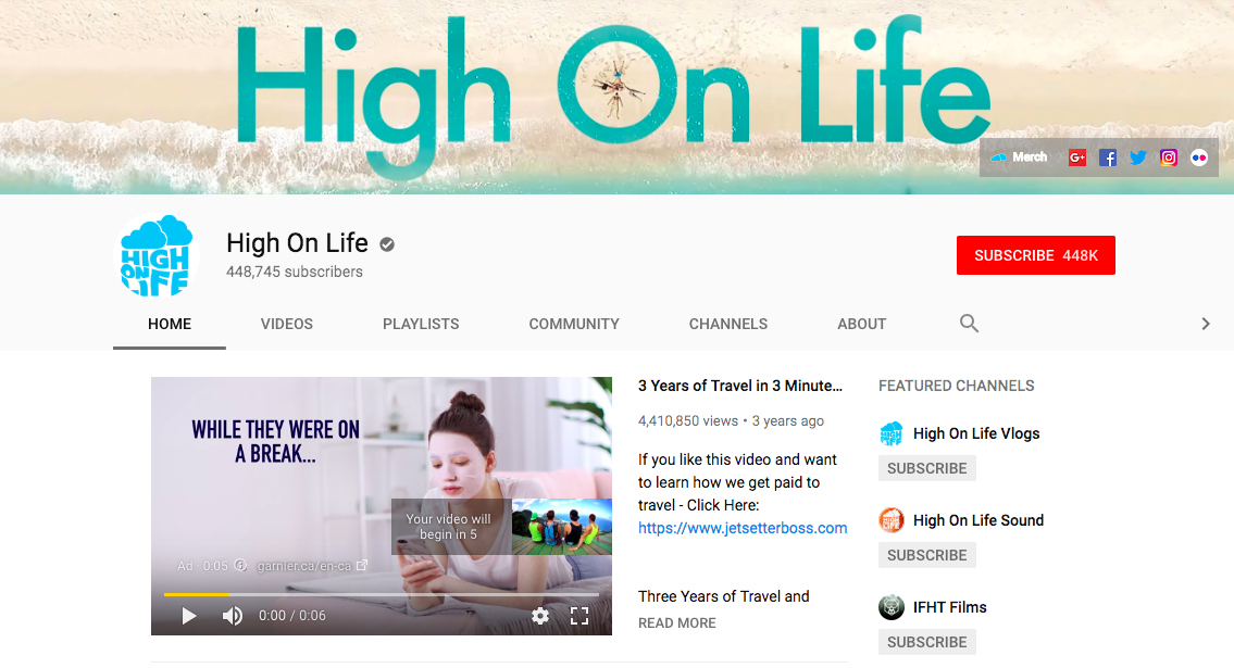
If you want, you can put even more focus on the title in your banner design. For example, take a look at how the popular travel channel High On Life uses a simple background image, allowing the big, bold font to stand out:
5. Use a font that reflects the mood of your channel
The fonts you use can communicate what the tone, style and even topic of your channel are. That’s because people tend to associate different personalities with different fonts.
For example, which font looks happier to you?
Probably the bouncy second font, right?
We associate different fonts with different industries. For example, serif fonts are typical of more traditional industries like publishing and insurance. Meanwhile, sans serif fonts are more commonly found in branding for tech companies.
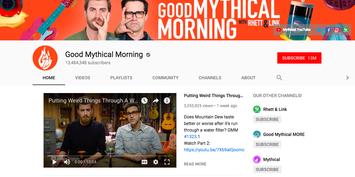
While certain fonts looks more reliable and traditional, other fonts look more casual and playful. For example, take a look at the font that the comedy duo of Good Mythical Morning use in their banner:
The font is a bit quirky and not too serious.
Or take this YouTube banner template that uses a decorative font to give it a creative feel:
Now look at the more serious and reputable serif fonts used in Veritasium‘s banner. Their videos teach science and engineering concepts, and they’ve gone for a look that is in-line with more traditional education industry branding:
See how fonts affect the overall tone of a channel?
Read our Netflix font psychology study to learn more about font personalities.
6. If you use a photo, make sure it’s high-quality
A blurry image can ruin an otherwise awesome design. The images you use in your YouTube banner should have a minimum resolution of 100-150 dpi.
Most stock photo sites like Unsplash or Pexels will provide images in high-quality. (Venngage also has a stock photo image library with high-quality photos!)
But if you’re using your own original images, make sure they are crisp and clear when you upload them to YouTube.
7. Include a call-to-action in your YouTube banner
Your banner is prime real estate on your YouTube profile. If there’s an action you want visitors to take (like, say, slamming that subscribe button), why not include it in your banner?
A call-to-action (or CTA) is a phrase or button that asks readers to do a specific thing, like following you on Twitter or signing up for your newsletter.
Content marketing guru Neil Patel is never afraid to throw a CTA at you, so why should you be?
If you have a promotion going on, or an upcoming event you want your audience to know about, your banner is also a great place to mention it.
8. Coordinate your YouTube banner with your channel icon
If you want your YouTube profile page to look professional, every design element should blend seamlessly together.
The first things viewers will probably look at when they land on your profile is your banner. The second thing will probably be your channel icon.
That’s why it’s a good idea to use the same color scheme and visual style in both images. Typically, you should use your brand colors.
For example, take a look at how well the POPSUGAR Fitness YouTube banner and channel icon go together:
9. Be mindful of design trends in your niche
Take another look at the baking YouTube channel template I showed earlier:
The pastel color scheme, personal font style, and whimsical image are what viewers would expect of a baking channel. Popular baking YouTuber CupcakeJemma uses a script font and sprinkle-inspired background for her banner as well:
10. Create your own custom YouTube banner template that you can repurpose
Once you’ve created a YouTube banner that you’re stoked to use, why not make it into a template that you can repurpose again and again?
A custom template will come in handy if you want to switch up your banner design periodically. For example, you could simply swap out the background image based on what you’re currently promoting on your channel:
By using the same template, you can keep your channel design fresh while maintaining your recognizable visual branding.
Get those subs!
With a quality YouTube banner, you’re one step closer to growing your audience. Remember, creating a strong brand requires a multi-faceted approach, beyond just the videos you put out.
Want some more tips for building a strong brand? Here are some more guides to help you out:
How to Create a Brand Style Guide Like These Top Tech Companies
60+ Brand Guidelines Templates, Examples & Tips For Consistent Branding
Increase Blog Traffic And Boost Engagement With These 37 Proven Methods
Social Media Images: The Ultimate Guide to Designing Epic Graphics [Free Ebook]


