Posters are one of the oldest, most tried-and-true types of marketing collateral. Posters are an effective way to draw attention to your sales, events, fundraisers and more.
While there is no one right way to make a poster, there are still poster design best practices that you should follow.
So we decided to take it upon ourselves to write the ultimate, most in-depth poster design guide out there. If you want to learn how to design a poster from scratch, you’re in the right place.
These poster design tips can be applied to virtually any poster you design. So let’s get into it!
Click to jump ahead:
- Identify the goal of your poster
- Consider your target audience
- Decide where to share your poster
- Select a professional poster template
- Pick a relevant or branded color scheme
- Include a clear call to action
- Use fonts to create a hierarchy of information
- Use icons to visualize concepts and grab attention
- Add high-quality images & stock photos
- Download & export in the right format
- How to design posters for different occasions
How to design a poster from scratch
1. Identify the goal of your poster
The most important step in the poster creation process is to understand why you are creating this type of promotional material in the first place.
Is it because of advertising purposes for a new product? To grab the audience’s attention about a concert in the area? To highlight important details about a campaign? Or even just because there’s a sale coming up? All of these are goals that some engaging poster templates can help you achieve.
If you think about your main goals from the beginning, you can use those goals to guide your choices like a professional designer would.
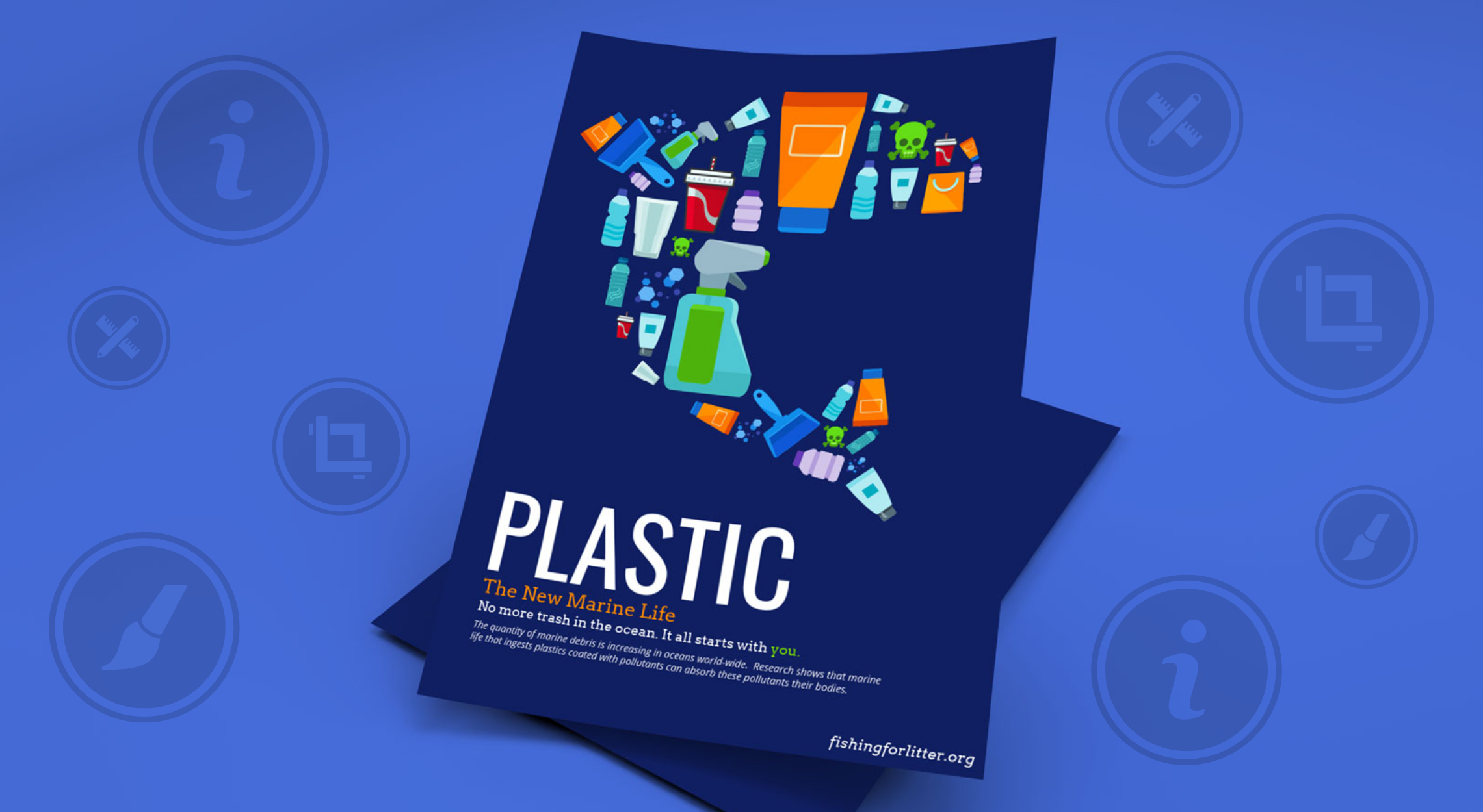
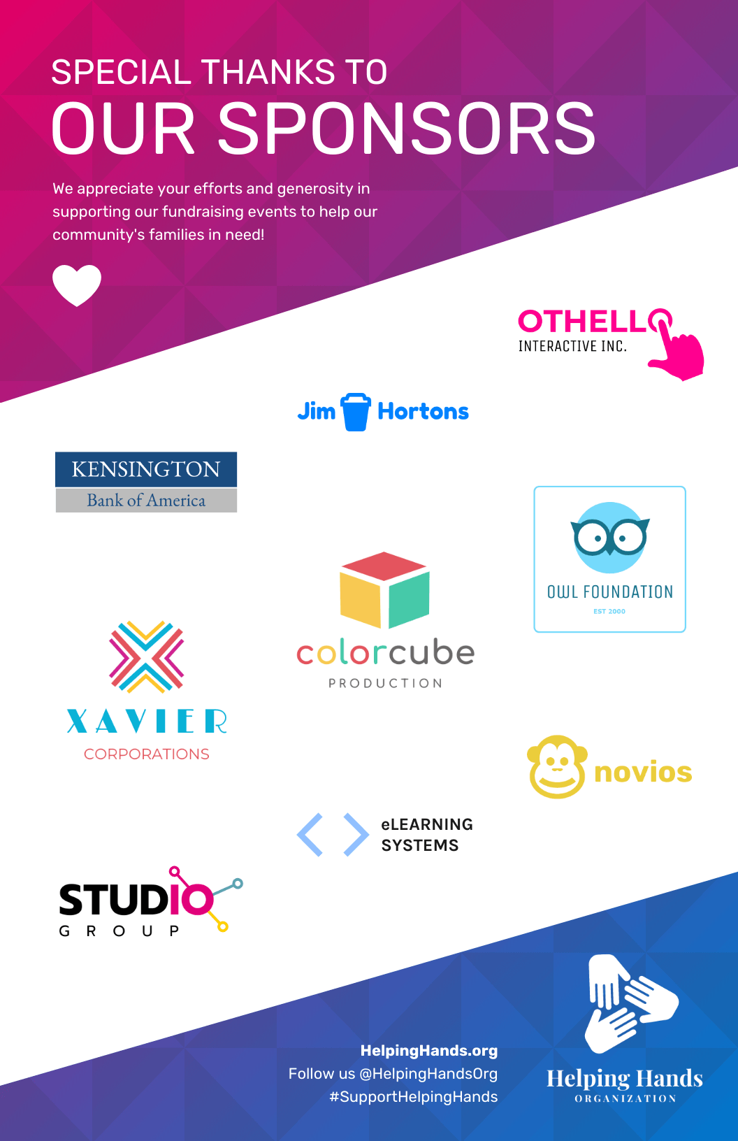
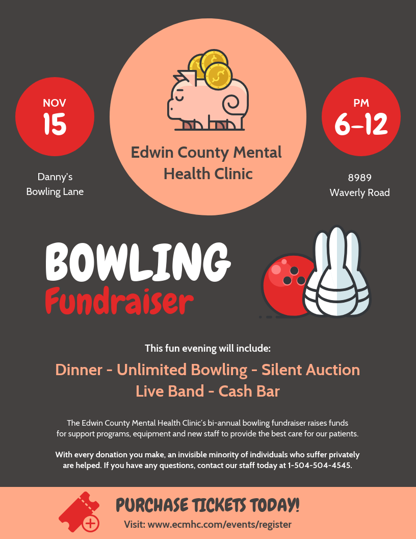
For example, if the goal of your poster is to invite your community to a fundraising event, then your poster should be designed strategically to help you achieve this goal. A common rule for written communication is that simplicity wins.
Take a look at another fundraising event poster:
Just so you know, some of our poster templates are free to use and some require a small monthly fee. Sign-up is always free, as is access to Venngage’s online drag-and-drop editor.
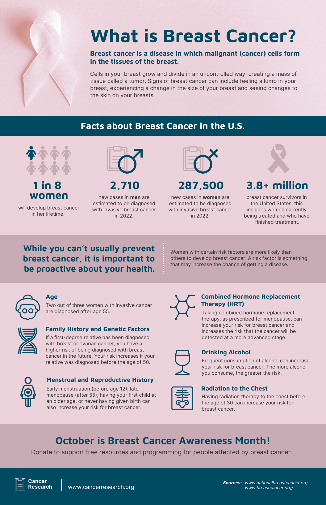
Now, if you’re looking for information posters for your fundraising event, here’s another example you can keep in mind:
Start with a goal and plan your custom poster around it.
2. Consider your target audience
Next, you should consider who you are trying to reach with your poster. Answering this question will probably remind you of all the important details you should highlight while you make your poster.
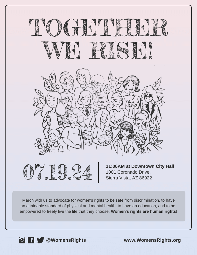
For example, say you’re advertising an event for women’s rights like below:
Now compare it to this other design below:
The goal and audience on each of these templates are different and both designs will appeal to distinct groups of people. Make sure you have decided exactly who you want to appeal to, before jumping into your online poster creator tool and starting your creation process.
A perk of these eye-catching posters is that we can see inclusive visuals, maximalist elements and bold shapes — which happen to be some of this year’s biggest graphic design trends.
Also, remember that you can make multiple posters that cater to different customer personas. You don’t have to use one for every type of customer!
3. Decide where you want to share your poster
The final thing you should determine to save time — before designing your poster — is where it will be shared.
Would you like to hang it up on a wall? Or just share it with your followers on social media so they can leave comments and send it to other friends?
It’s important to decide where you want your poster to be seen before you start working on your online poster maker. This is because, as you will see below, optimizing a poster properly for print is slightly different than for Twitter or Facebook.
Optimize your poster for print
You probably have an idea of where you’re going to share your poster. Where you decide to pin it up can help you make a few design decisions.
If you’re planning on printing out your poster, there are some basic guidelines you should keep in mind.
Visualize where you will pin up your poster
If it’s going on a wall with a bunch of other movie posters though, print your poster in a larger size so it will stand out:
But if it’s going on a relatively bare wall, print it in a smaller size and pin up a bunch of them to then create posters with a larger footprint like the minimalist poster templates below:
If you’re looking for more ideas to present your findings effectively, search through our selection of scientific poster templates.
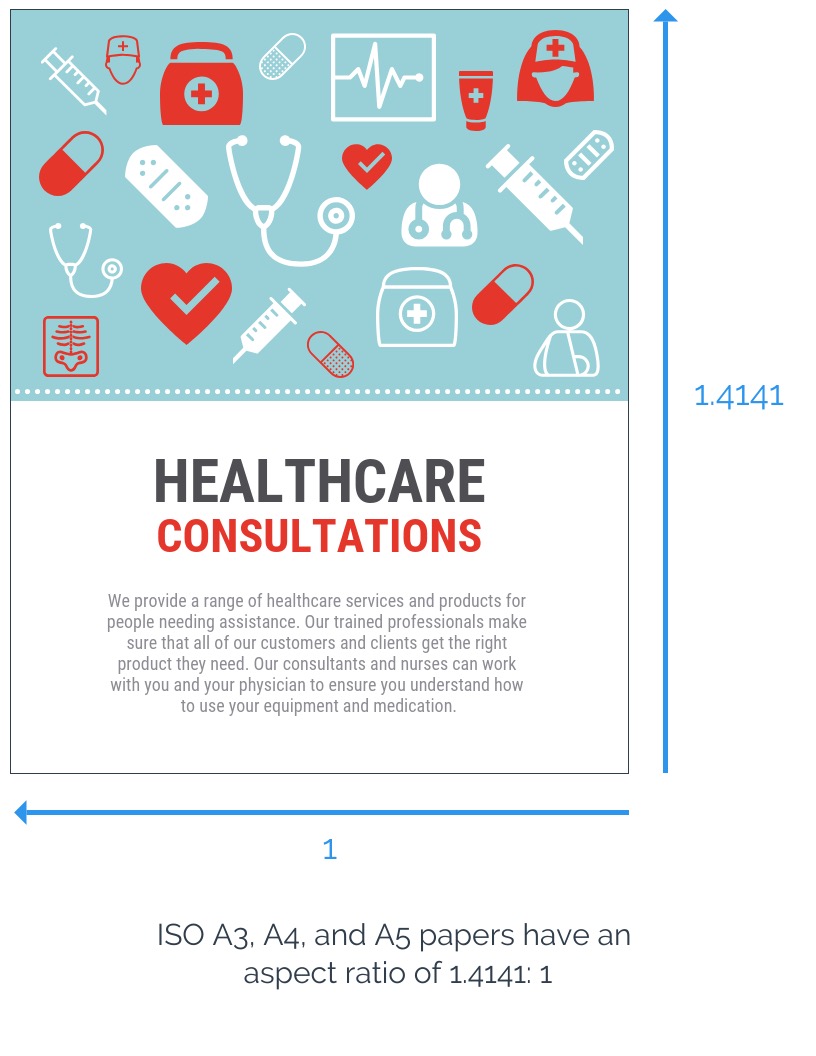
Select a standard paper size
Unless you want to create a big poster background, you probably don’t want to spend money on getting it printed. You can print it yourself by simply designing your custom poster to fit the standard ISO A1-A5 printer paper.
With Venngage you can magically resize any of our poster templates into Letter, A3, A4, A5 and any custom dimensions with a few clicks. First, click on the Settings tab and then select what size you would like:
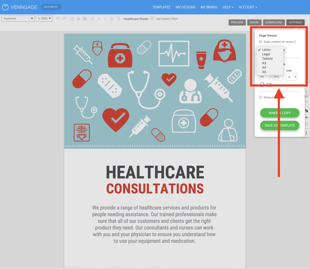
The page resize option will also reformat your poster content to fit the new size you select — if you want it to. This simple feature will save you a TON of time in the long run, so be sure to try it out.
You’re more than welcome to manually resize your poster the old-fashioned way, by updating the page size:

You can also set the size of your poster background in Pixels, Inches, or Centimeters as well.
That said, for most of the posters that you’re going to print out, it’s best to use the preset sizes. This will ensure that your printer can actually print out a beautiful poster.
Set bleed marks for printing
In printing, “bleed” is when you have an image or object touching the edge of the page. When you design a poster with an image that is flush with the edges of the poster, your printer will automatically leave a thin white space around the edge of the paper.

When your document has bleed, it needs to be printed on a larger sheet of paper than the design and then trimmed down to your intended dimensions.
Like with resizing in the previous section, you can automatically add bleed marks to your poster with a single click. Just click this checkbox in the Settings tab and the bleed marks are automatically added:
As you can see in the poster example above, there’s now a white border added to your design. This is — you guessed it — the bleed marks!
Optimize your poster for social media
There are fewer restraints when designing a poster for web than for print. This is a great opportunity to do something really fun with your design. Still, there are some guidelines you should follow.
If you want your poster to look really good on social media, size it for the specific platform you’re promoting it on. You may want to make a couple of different versions of your poster for different platforms.
Remember, a square or portrait orientation looks best for mobile viewing. People are used to scrolling up and down on mobile, rather than side to side.
These are the ideal dimensions for each of the big social media platforms:
- Facebook: 1200 x 628, or 1200 x 1200 for square
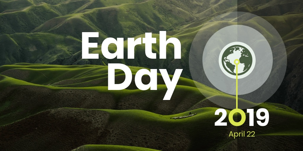
- Twitter: 1024 x 512
- Instagram: 1080 x 1080, or 1080 x 1350 for portrait
- Pinterest: You have more wiggle room here for length, but try to use a ratio of 2:3 to 1:3.5.
If you’re creating an advertisement poster for Twitter or Facebook, banners generally fit better on their newsfeeds. In that case, landscape orientation is fine.
Or if you’re looking for awareness campaign poster ideas to share on a Pinterest board:
4. Start with a professional poster template
You don’t need to hire professional designers to create powerful poster backgrounds. Designing your own poster might sound intimidating but with Venngage’s free poster maker, you can make an engaging poster online — for business, virtual events, scientific facts, and much more.
A poster template will give you a foundation to create your own poster stand, your own design.
Start by picking a template that will help communicate the goal of your poster. Look for templates that reflect your poster’s theme or have the right layout you’re looking for.
Here are some things to keep in mind when picking a poster template:
- Look for a poster template with a layout that fits your vision and goals (ex. header placement, image placeholders, icons and more).
- Pick a poster sample with the right dimensions for where you will be sharing your poster (ex. on a wall, on Facebook, in an email marketing campaign, etc).
- Remember that you can always customize your templates if there are aspects of the design that you don’t like.
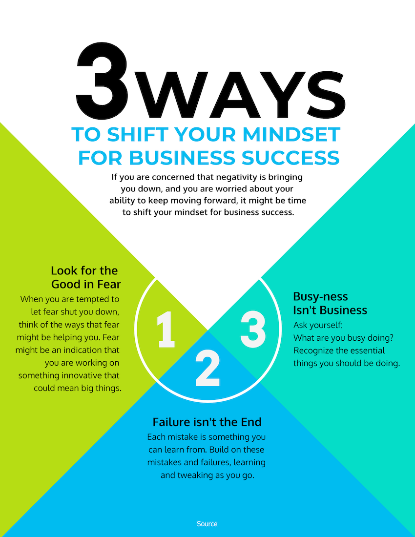
For example, if you want to create a poster for your job fair, you would want to focus on the location, date, and jobs available:
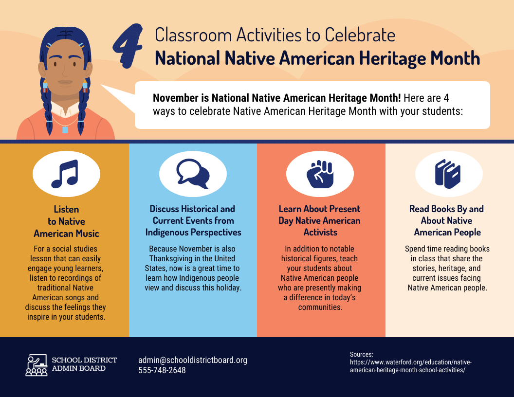
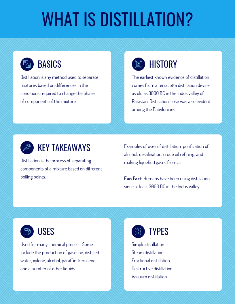
However, if you’re creating information posters to raise knowledge and awareness about an important holiday or event:
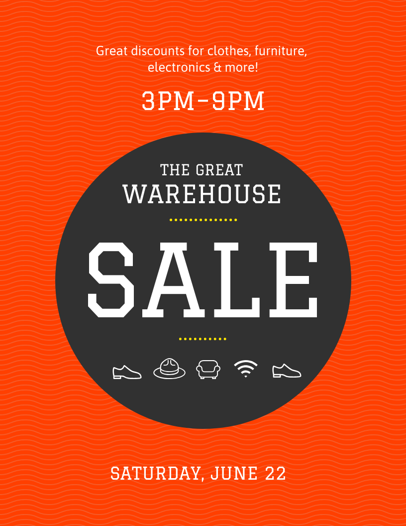
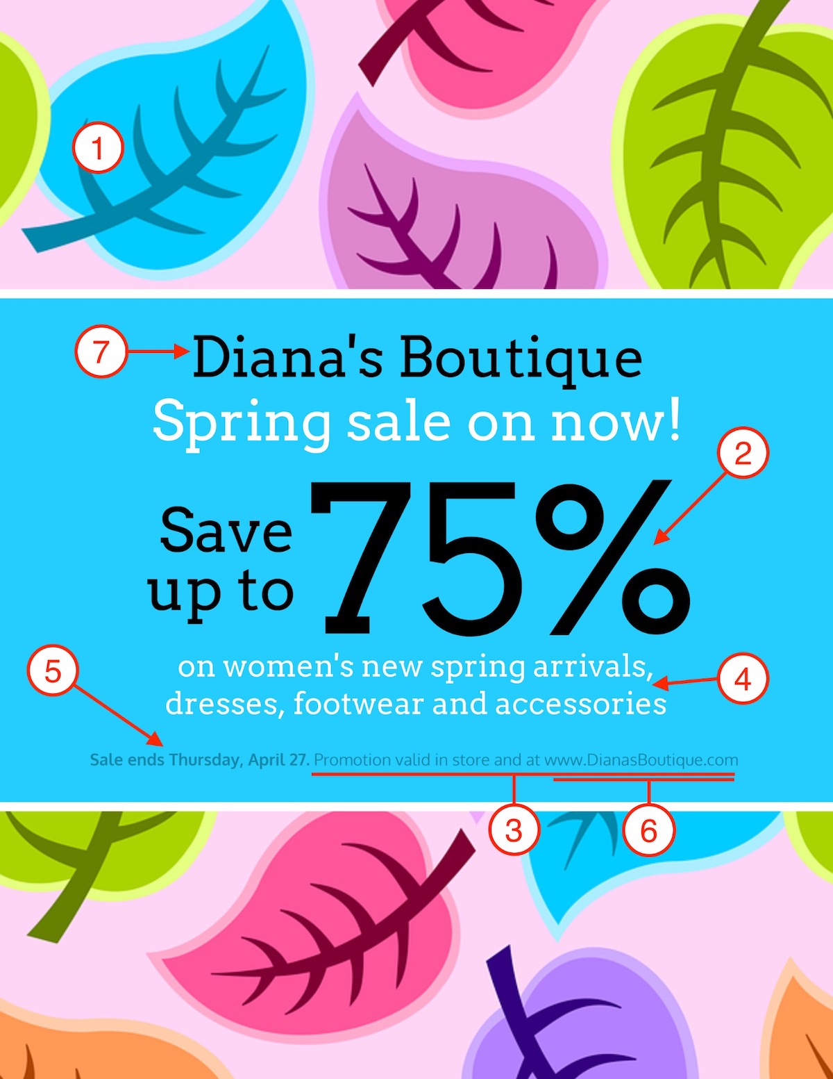
If you’re creating an advertisement poster to promote a sale, the discount and date are probably should be the most eye-catching parts of your poster:
As you can see, these are all great poster templates, but each example is designed to help you achieve a unique goal. So just make sure you are picking a template that fits your goal and you will save a ton of time.
Now if you want to learn how to create an event poster, business poster, sales poster and more, jump to the last section. There you will find a more in-depth guide on creating a killer poster.
5. Pick a relevant or branded color scheme
One of the first things that someone will probably notice about your poster is the color scheme.
In most cases, the appropriate color scheme will be obvious. So try not to overthink it!
For example, if you’re creating a poster for a winter event, then a color scheme of warm green, red, and white will evoke the feeling of the holidays.
If your company has strict brand guidelines you need to follow, then you can incorporate your brand colors into your custom posters.
Now if you want to use your brand colors on any of our poster templates, just click the My Brand Kit tab on the left side of the screen:
Then click one of your branded colors to add them to any poster template:
Click the palette again to change where the branded colors are used:
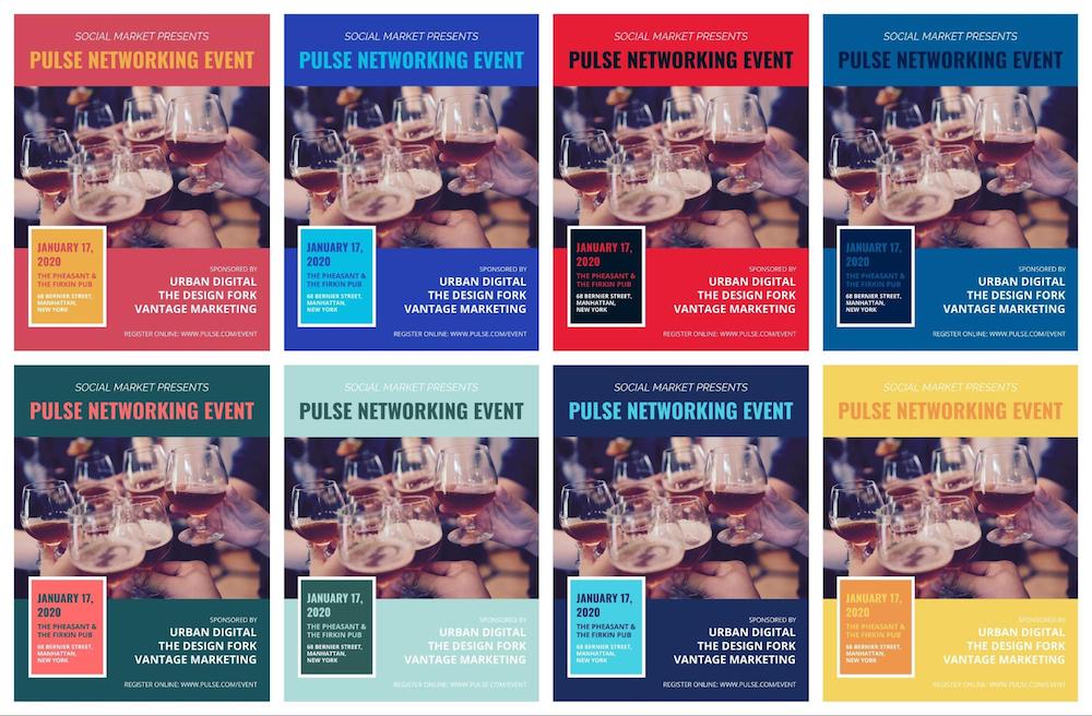
With a few clicks, you can create a ton of variations of your poster, like so:
However, if you’re still struggling to come up with a relevant color scheme, take a look at the meanings and emotions of each color.
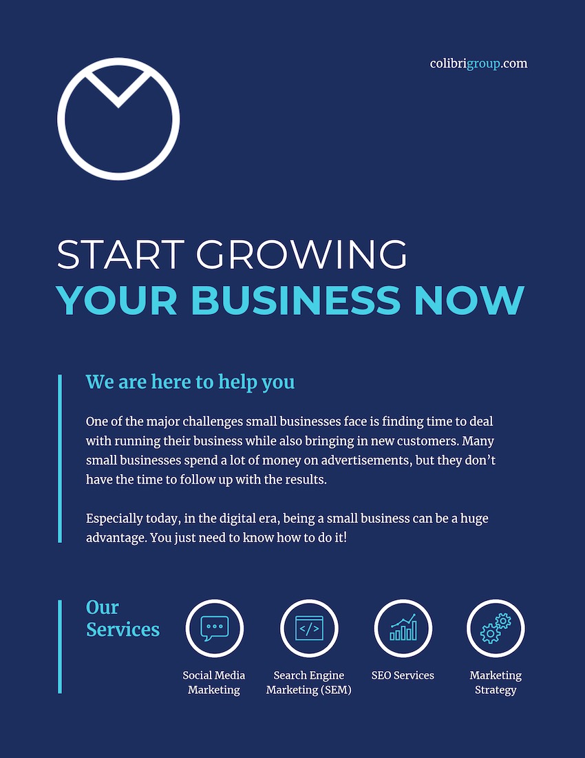
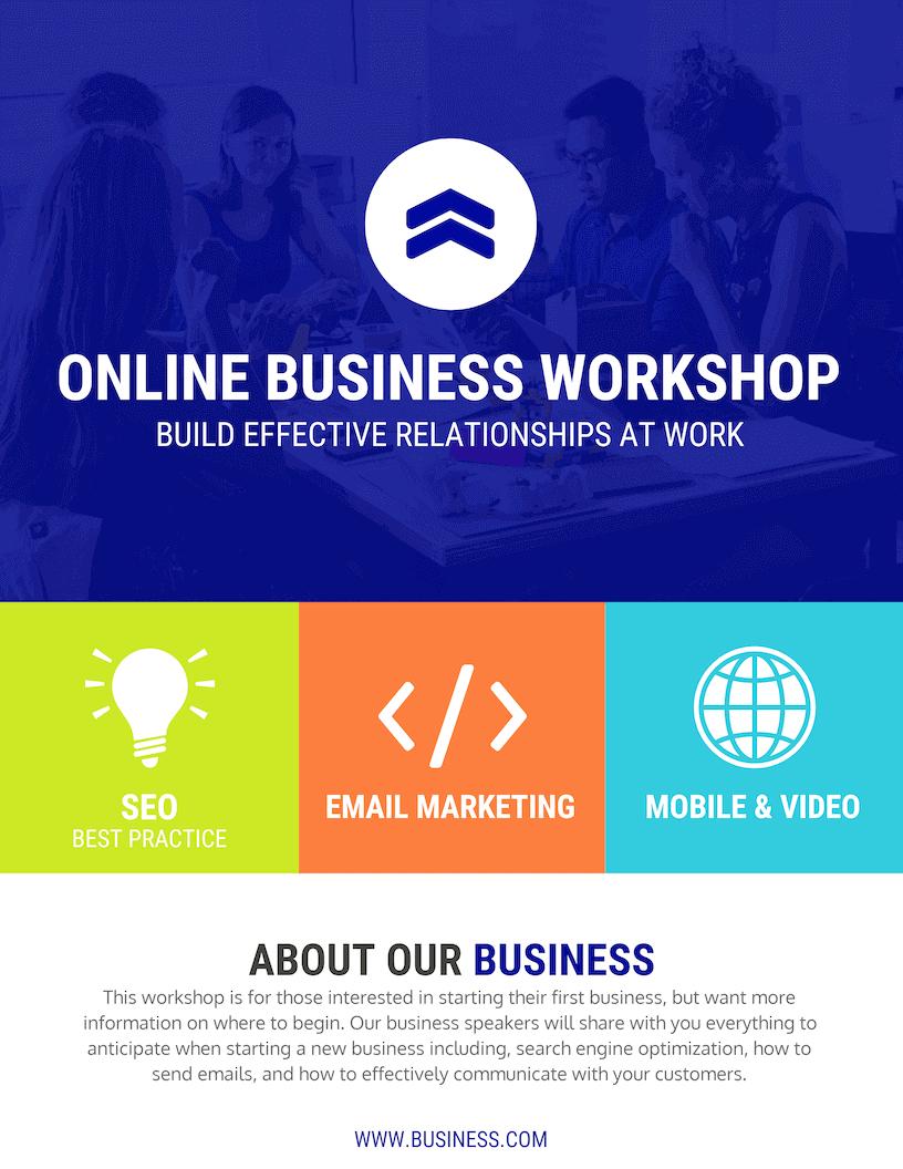
The color blue is usually associated with wisdom, trust, and loyalty. Use this color palette on a business, event, or marketing poster to make it feel very professional:
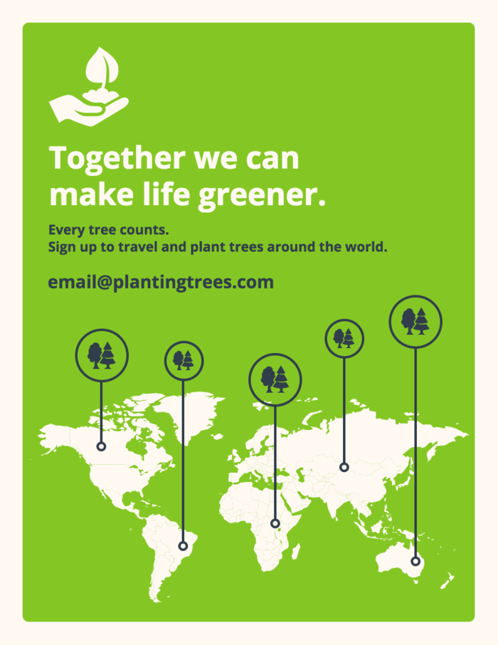
Green is associated with energy, the environment, and tranquility. It would make sense to use a green color combination on a nonprofit or fundraising poster, like below:
Red is associated with strength, courage, and joy. It also is super eye-catching, which you can see in the minimalist but stunning poster below:
As you can see, color theory should help you pick the right color palette in no time. Now if you’re not sure where to start when it comes to pairing colors, a color scheme generator tool like Coolors can be helpful.
6. Include a clear call-to-action
Once you have someone’s attention, you need to make it very clear what their next steps are to help. This is commonly known as a Call-To-Action (CTA).
Every poster, no matter the topic or type, should have a CTA. Otherwise, what is the point of creating a poster in the first place?
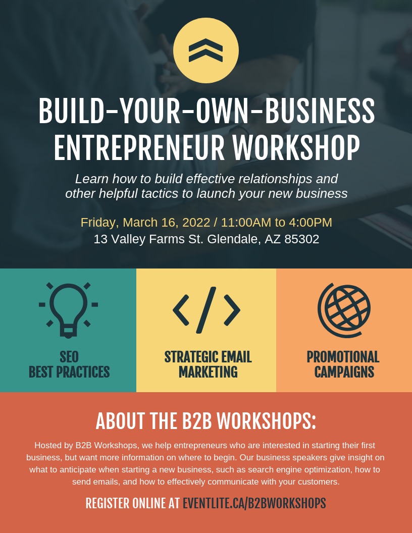
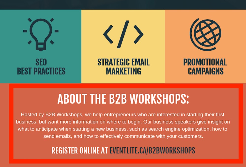
In this marketing poster template, the CTA is the “Register Online” at the bottom:
The designer made sure this CTA would stand out from the rest of the poster by highlighting it in blue and using a unique font.
Additionally, they made the CTA very simple to follow. You don’t want to make your CTA a chore, especially if your poster wants them to visit a website.
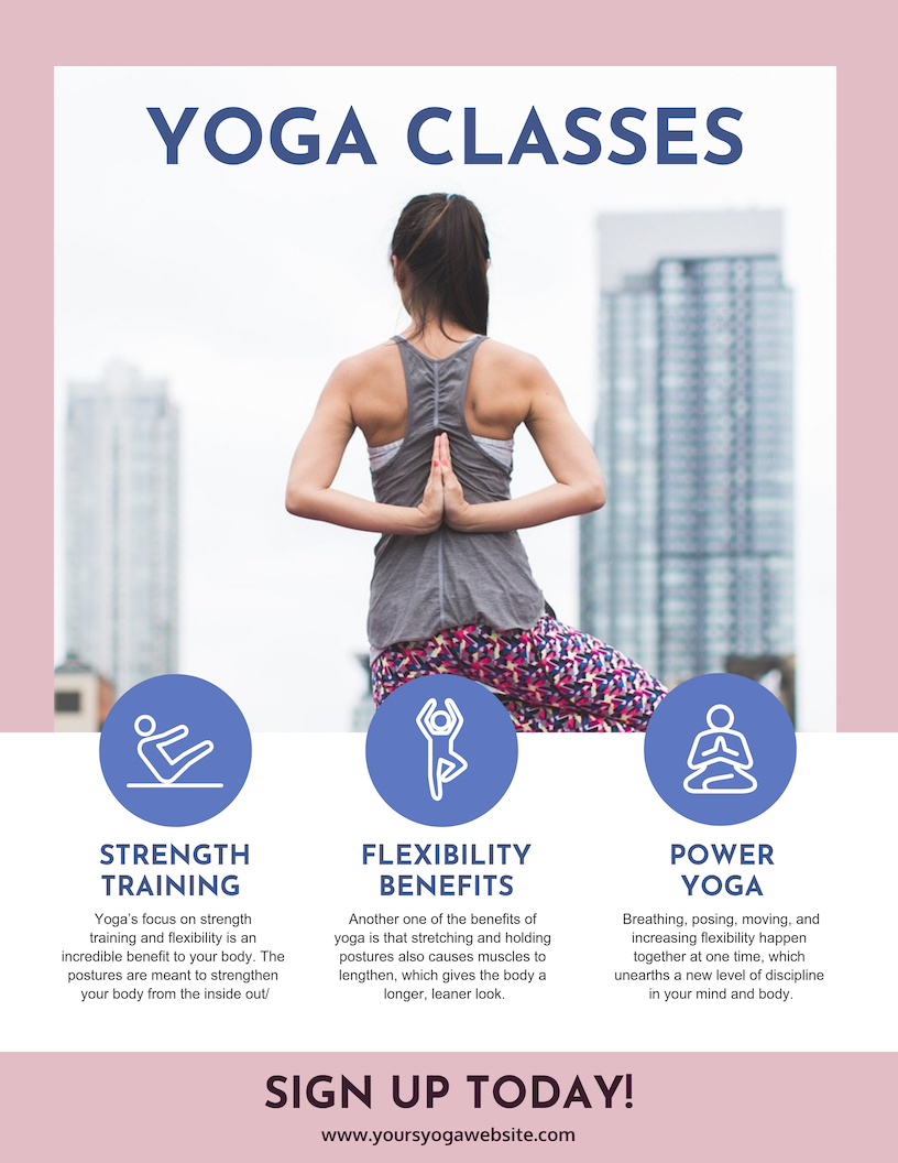
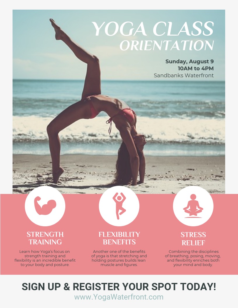
The same can be said about this fitness poster template:
But in this example, the creator of this poster made the CTA stand out even more!
As you can see these CTAs are both near the bottom of the poster. This is on purpose and allows the reader to get more information before taking action:
Can you imagine if the first thing you read on a poster was CTA? It would be very confusing and probably make you ignore the rest of the poster.
Not all CTAs require the reader to visit a website, call a business or make a purchase immediately.
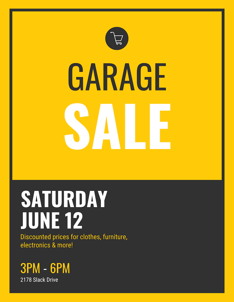
That action may be as simple as telling their friends about what they learned on the poster. Or about when a garage sale happens to be:
The call to action on this poster is actually the entire black section of the poster. The top section informs the reader and the bottom helps them take an action.
In this case, the action is visiting the garage sale, but it still is a CTA. Without it, no one would know what this poster was trying to get them to do.
7. Use fonts to create a hierarchy of information
What information you choose to include on your poster will depend on the goal of your poster.
But if you’re creating a fairly standard poster, it’s best practice to follow a hierarchy of information.
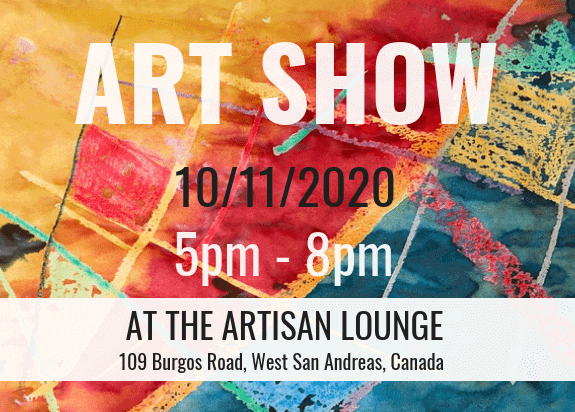
For example, if you are creating an event poster the information on your eye-catching posters should be read in this order:
- The name of your event.
- The date and time of your event.
- A short description of the event or a catchy tagline.
- The location of your event (if you choose to include it).
- A simple call to action like a website, social media page or contact number.
- The name of your company, department, organization, etc.
As you can see in this event poster design, the designer used a handful of different fonts to organize the information:
The title of the event obviously uses the largest font, because it will hopefully catch someone’s attention. It also will give the reader context for the other information on the poster.
But if they aren’t interested in learning more, they can quickly move on with their day after reading the title.
If they are interested in the event, they can move on to the next piece of information, the date.
The designer used a bright yellow to catch your eye directly after reading the title of the event. If they would have used a simple white, the information would have been easily overlooked.
The tagline of the event is italicized below the title, giving the reader a little more context about the event. Again, if this sounds interesting to the reader, they can move on to the next piece of information, and so on.
This process will help eliminate people who don’t really need to see the CTA at the end of your poster.
And finally, after moving through all the information, the CTA at the bottom uses another bold font and color so that people will not miss it.
Can you imagine how hard it would be to navigate this poster if they would have used the same font throughout? It would look like a term paper that no one wants to read.
Now if you’re struggling to decide what the hierarchy of your poster should look like, think about the most important info you want the reader to walk away with.
In this example, the title of the event, the location and the CTA seem to be the most important.
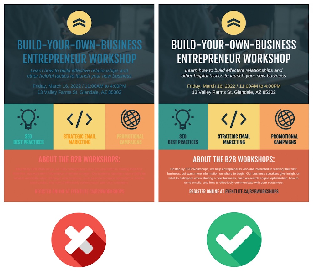
Additionally, the font color used in this design contrasts exceptionally well with the poster background color. If you choose a font that doesn’t contrast, it will be very difficult to read your poster.
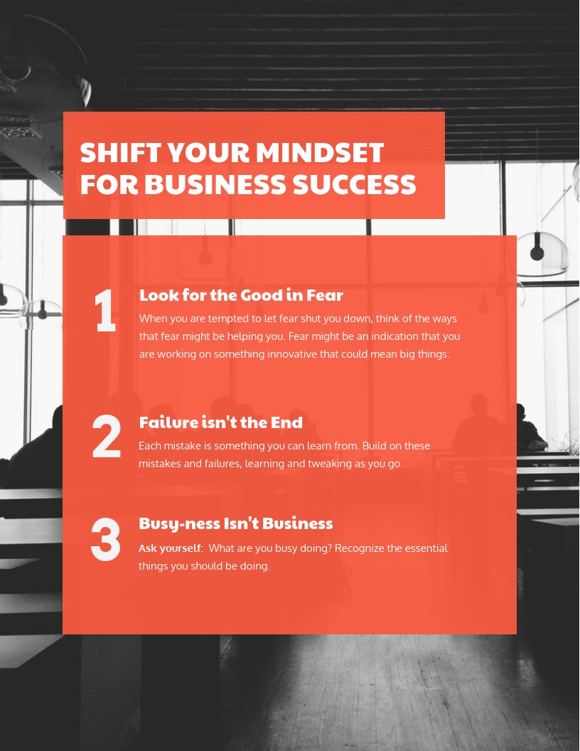
As you can see below, a good rule of thumb is to use a light font color on a dark background:
Or a dark font on a light background:
Even if you use a single font on your poster, you can quickly create a hierarchy of information just by changing the font’s color, size or weight. So again, don’t overthink it!
8. Use icons to visualize concepts and grab attention
Icons are symbols used in design to represent concepts. Icons are the perfect way to enhance your custom posters. You can use icons to embellish points and, in certain cases, replace text.
They’re also great for illustrating ideas quickly. Or you could make icons the main focal point of your design, like the template below:
Keep these best practices in mind when using icons in your poster design:
- Pick icons with a consistent style (line thickness, flat or illustrated, line art or filled).
- Use icons sparingly and allow for plenty of whitespaces to let your design breathe.
- Add a simple border or background shape to your icons.
- If you do replace the text with icons, make sure that the meaning is very obvious.
Let’s take a look at some of those best practices in action, starting with keeping your icons consistent.
As you probably know, there are a few different kinds of icons that you can use. Some are flat, and can be changed to match the color of your poster very easily:
While others are illustrated, and the colors can’t be changed:
Whatever icons you choose to use while designing a poster, just make sure the styles are consistent, like in the examples above.
So if you use a flat icon in one section, use flat icons throughout your poster and vice versa.
Next, let’s talk about using whitespace correctly when it comes to icons. If you’re not aware, whitespace is the open space around a design element like a block of text, a title or an icon:
Without it, your poster design will feel exactly cramped and unprofessional. It will also make your poster very hard to read or navigate. Check out how odd the poster below looks without adequate whitespace:
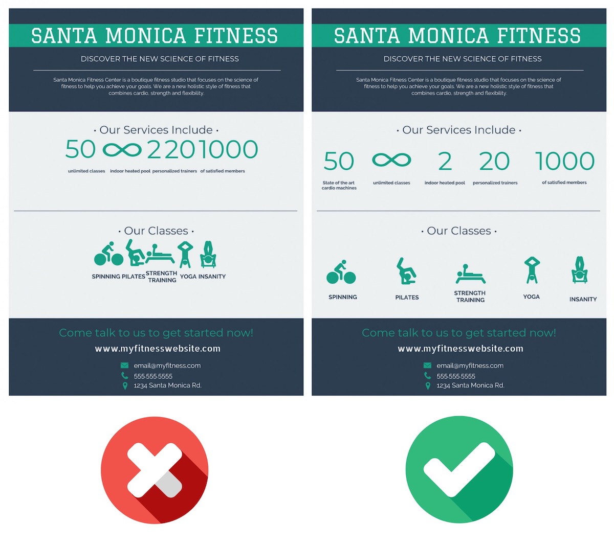
It looks like a mess, so be sure to take the time to use whitespace throughout your poster!
One very easy way that you can create this whitespace around your icons is by using a background or border shape. Each icon in the template below uses a background shape:
Using background shapes in this way will not only give your icons some room to breathe, but it will also make them a lot more eye-catching. Without the border shapes in the example above, the icons would have just faded into the background.
Plus, if you’re using illustrated icons it will make the design feel much more consistent across the poster:
And the finally best practice, be sure that if you replace text with an icon, the reader will actually understand it. The poster example below illustrates this tactic well in the contact section:
Readers are going to be able to decipher those icons because they are used a lot in the real world already. Others might not be so easy to understand, so you might have to add a label or title to them. Like below:
With Venngage, you can quickly swap any icon on your poster or one of our customizable poster templates, with just a few clicks as well. First, select on any icon on your poster and then click the Replace button:

Then just search for the icon that you want, and click on it to replace:
It’s really that simple and can help you turn any template into your own unique graphic in no time.
9. Use high-quality images & stock photos
If you have been paying attention to the templates and examples in this article you may have noticed that they use a lot of premium images.
Venngage’s free poster maker tool offers free and premium images, icons and graphs to help you edit poster designs with ease — no prior design skills needed. Here are some examples of stock images in the background:
While others make it one of the main focal points of the poster:
But all of them use very high-quality images, no matter the type of poster.
If you plan to print out the poster or enlarge it, using high-quality photos is important. The slight blurriness or pixelation will quickly become a nightmare.
It doesn’t matter if you are using a stock photo or one that you took, all of them should be very crisp and clear. Sometimes it’s better to use a professional stock photo in place of a blurry personal photo as well.
Plus, Venngage’s free poster maker tool is integrated with Pixabay and Pexels to elevate your design. Access stunning, professional photography with just one click.
Just head over to the left sidebar and click the Photos tab to bring up the search bar:
Once you find the perfect stock photo just click the photo to add it to your poster.
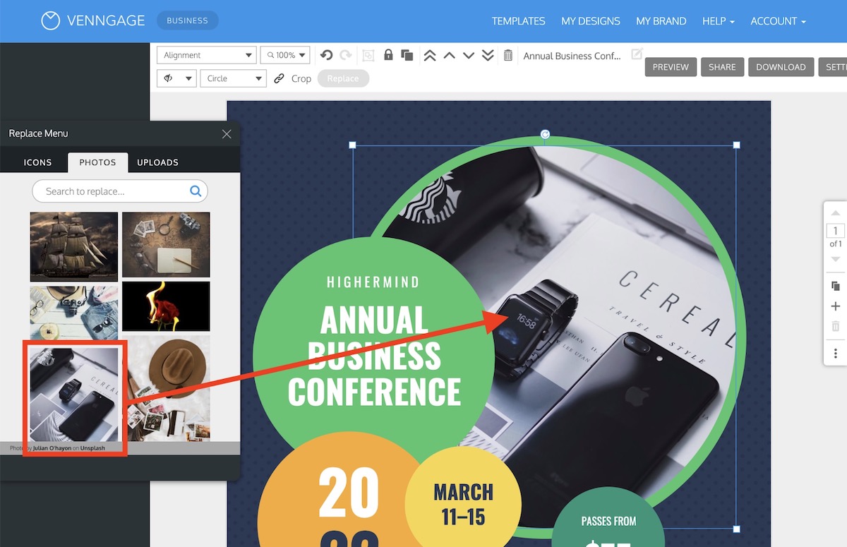
Additionally, like with icons, you can swap any photo on your poster using the Replace button:
After you select Replace, you can search for any stock photo in our library and insert it into the poster with one click:
Now if you don’t want to use any of our stock photos, you can upload your own images by dragging it on the screen or by selecting Image Upload in the left sidebar:
As you can see, adding your own photos to your poster is very easy, just make sure you pick the right ones.
10. Download & export your poster in the optimal format
After you have finished your poster, it’s time to share it with the world. On Venngage you can quickly download your poster by clicking the Download button on the right side of your screen:
Then select what type of file you would like your poster downloaded as:
Downloading your poster as a PNG should be fine for emails or social media.
But if you want to print out your poster, download it as a PNG HD. This will make sure your poster is crisp and perfect once it gets back from the printer!
Phew, that was a lot of info! Need a quick recap or want to share this information with your team? We have you covered with this video:
How to design posters for different occasions
All of the advice we outlined above can be used on almost any poster. But in this final section, we are going to get a little more specific.
Below are some of the most popular types of posters that you can create.
But instead of waxing poetically on each type of poster, we are going to outline a simple checklist for each type of poster!
So let’s get into it!
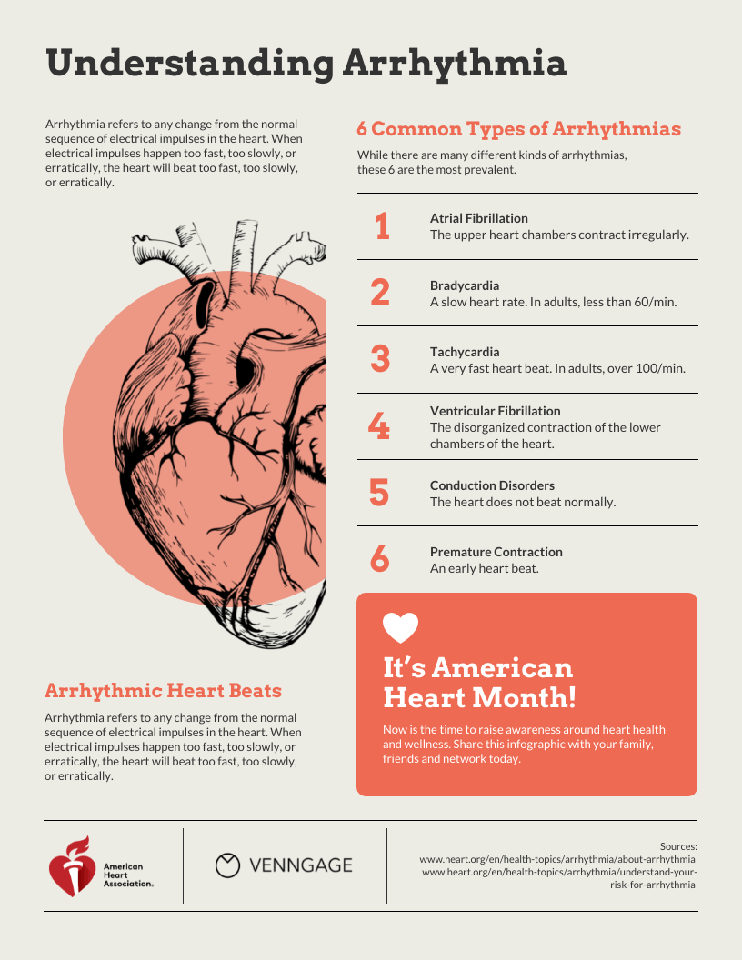
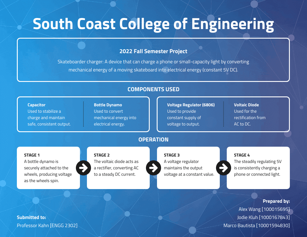
How to make an infographic poster
- Choose a powerful topic you’d like to inform about.
- Do your research and gather relevant facts.
- Select an outstanding template that’ll help you grab attention.
- Add icons and graphs. Data visualization is key in an infographic poster.
- Create a content hierarchy and highlight the most interesting insights.
- Add your logo and company’s branding.
- Download in multiple formats and share.
Related: What Is an Infographic Poster and How To Make One?
How to make an event poster
- Start with an interesting background image or color.
- Use a large and bold font for your event title.
- Add some embellishments to the title to make it pop.
- Add the date, location and time of the event.
- Include a simple call to action.
- Describe your event or why people should attend.
- Make sure you add your logo and brand colors.
Related: 10 Event Poster Design Ideas [+ Free Templates]
How to make a marketing poster
- Arrange the 4 P’s of your strategy: your product, price, promotion and place.
- Choose a design that will mark your audience and look good in your selected place.
- Make your campaign details the focus of the poster.
- Add high-quality images of your product or service.
- Include a relevant call to action.
- Incorporate your branding.
If you want to dig deeper into the steps to create a marketing poster and find campaign poster ideas, read this article: How to Design a Marketing Poster (10+ Templates Included).
How to make a sales poster
- Start with a simple background color or texture.
- Make the savings or discount the main focal point.
- Show where or what store the sale is taking place.
- List exactly what products are on sale or discounted.
- Add the start and end date or time of the sale.
- Add some contact information or a website
- Include your branding or logo.
How to make an HR poster
Summarize important information, helpful resources, processes or events information.
- Define the department you’re referring to.
- Include only the key information.
- Choose the best layout to showcase your announcement.
- Customize a brand-aligned design.
- Optimize your poster for distribution.
Related: 17 Essential Human Resources Poster Templates (Updated).
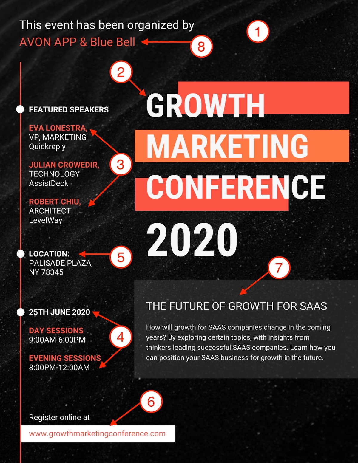
How to make a conference poster
- Start with an interesting background texture or color.
- Use a large, eye-catching font for the conference title.
- Outline the speakers, events, or special guests.
- Add the time and date of the conference.
- Add the location(s) of the conference.
- Include a CTA for tickets or to sign up.
- Describe why people should attend this conference.
- Add the logo or branding of the conference organizer.
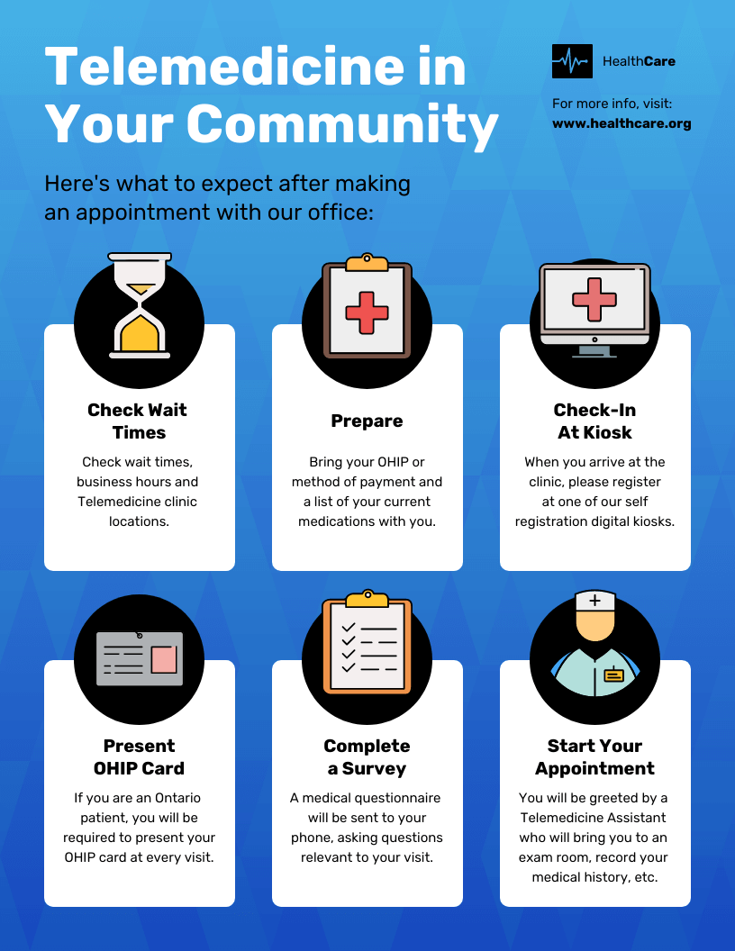
How to make a medical poster
- Select your health awareness topic or medical information theme.
- Write a catching title with bold fonts.
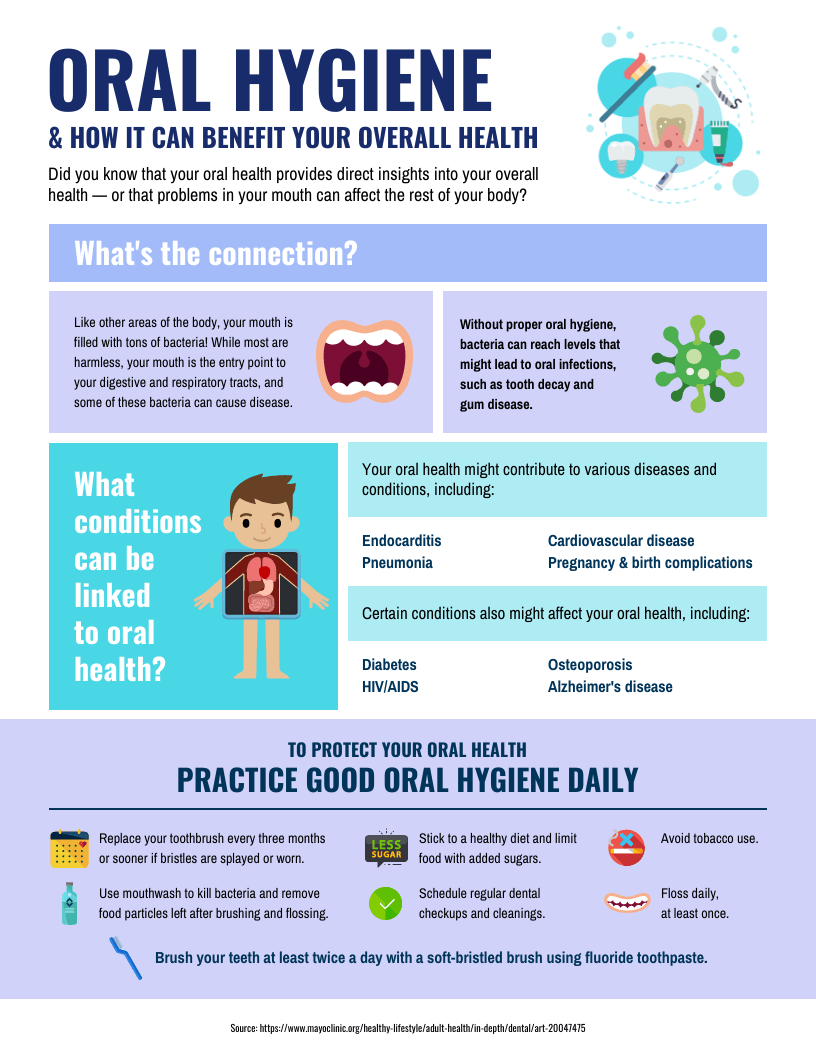
- Highlight important data, stats and recommendations.
- Add images and icons to ease retention.
- Invite your audience to a website or to access more resources.
Related: 15 Medical Poster Templates for Patient Education.
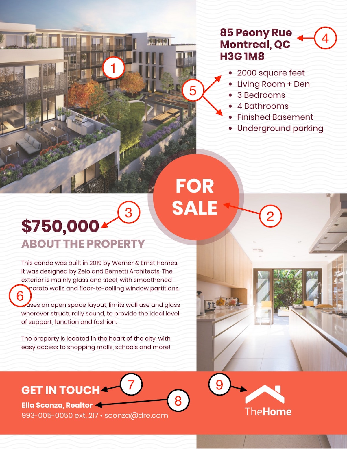
How to make a real-estate poster
- Include a few high-quality pictures of the house or listing.
- Add an eye-catching “For Sale” or “For Rent” header.
- List the purchase price or estimated rent.
- Add the address of the house or listing.
- List a few of the most interesting features of the house or listing.
- Elaborate on the listing, location, or real estate agency.
- Add a simple call to action.
- Include the contact information for the real estate agent.
- Add the logo or branding of the real estate company.
Hopefully, these simple checklists will help you create a poster in no time!
If you want to learn more about designing these types of custom posters, start with these articles:


