Think about some of the most creative posters that you have seen throughout your life. I know that there are a handful that stick out in your brain.
Now, what makes all of those posters so memorable? Honestly, it takes a lot of things working in perfect harmony.
In this article, I’m going to show you how to bring all of those together to come up with a creative poster idea.
Here are 55+ creative posters ideas to inspire you, so you can create your own.
1. Mix bold complementary colors with a simple poster layout
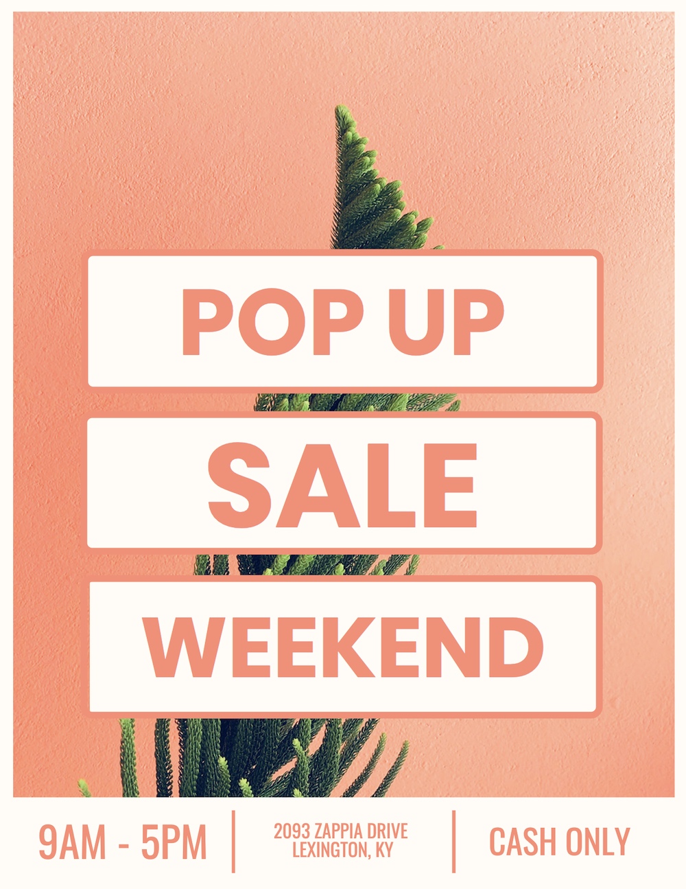
Let’s be honest, this creative poster looks like it belongs on the wall of your favorite local boutique or coffee house. Maybe the one that knows you by name because you’re in there a little too often.
The designer pulled off this trendy look by combining a complementary color palette with a relatively simple layout. As you can see, the orange background really helps the off-white sections jump off the page. And the succulent, which is always trendy, adds a bit of interesting green to the poster background too.
Related: How to Apply the Right Layout To Your Poster
2. Start with an eye-catching poster background image

Most of the time your poster background image or graphic is going to dominate the design. It’s also going to be the first thing that a reader will see, so you need to make it count.
These days many people just slap a vague stock image on their poster and call it a day. Now I have a well-documented hatred of most stock photos, but with this event poster template, they absolutely nail it.
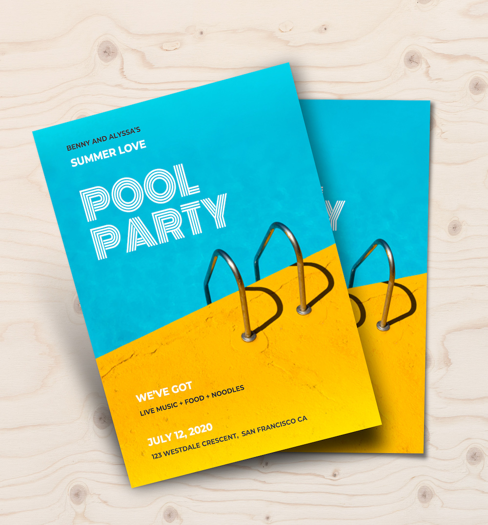
From the bold color palette to the way the image naturally divides the poster, to the modern font choice. It all comes together perfectly. Honestly, it may be one of my favorite creative poster ideas in this article! And it hurts me a little to say this, but the stock photo is what makes it perfect.
Just so you know, some of our poster templates are free to use and some require a small monthly fee. Sign up is always free, as is access to Venngage’s online drag-and-drop editor.
3. Create the best motivational posters by using color overlays
The best motivational posters are simple and clear. They typically use an inspiring or breathtaking image, and pair it with a really bold message. However, sometimes the perfect image is very busy and colorful. When you add text it seems to just disappear into the image.
To solve this problem, you can apply a color overlay that’ll subdue your background photo. You can check out this motivational poster example to see how a color overlay works.
With a simple transparent layer, you can turn a vivid or colorful image into a reserved background in seconds. Plus, the color overlay helps the text on your motivational poster jump out at the reader.
4. Use leading lines to direct the reader’s eyes on your creative poster
Leading lines direct the eye towards the focal point of an image. Using leading lines is a great way to compose a memorable picture. This photography composition concept can also be used to create a memorable poster as well, like in the example above.
In this case, the lines of the buildings naturally direct the eye down the poster to the job listings.
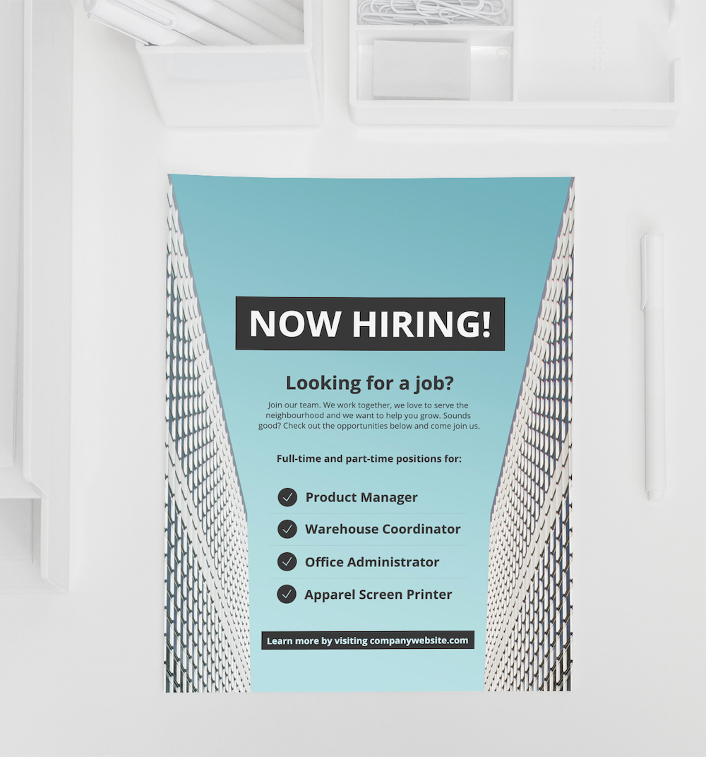
Without those leading lines, readers might not even notice the job listings. And this company would miss out on some great employees.
5. Create your own custom icon story
If you’re struggling to think of a creative poster idea, don’t worry icons are here to help! Because they are so versatile and plentiful I try to use them in all of my projects, especially posters.
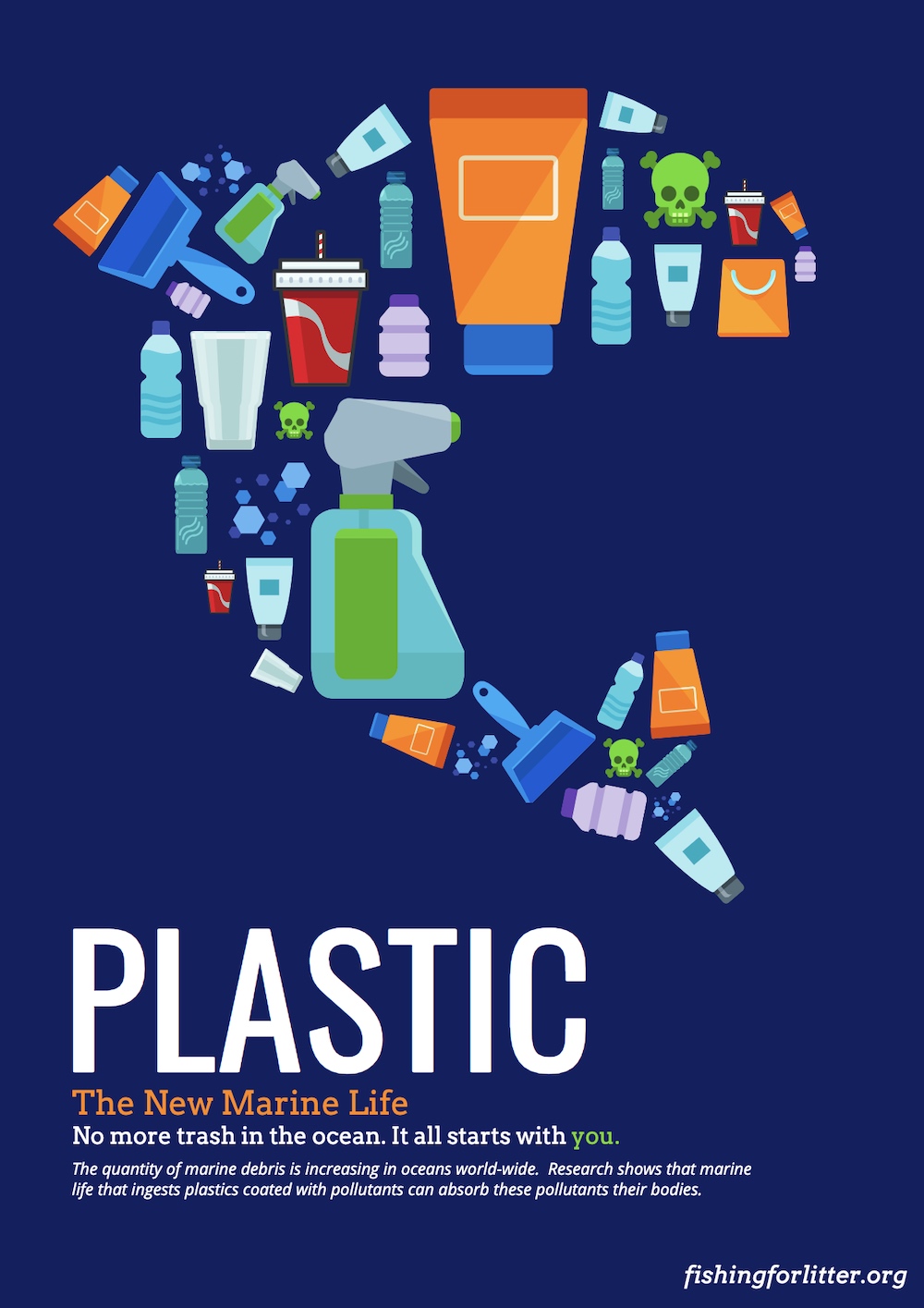
As you can see in this informational poster, a collection of pollution centric icons come together to form a dolphin from scratch. All it takes is a few clicks like so:
And you can create your own icon story in no time!
Using icons to create a whole new story is very powerful and will make people stop to learn more. Especially if they are passionate about conservation, or just love dolphins.
6. Make your poster pop with a two-toned title
One of the quickest ways for a designer to upgrade their creative poster idea is to use a two-toned title. Pick two contrasting colors that pop from the background.

This approach can instantly make any header eye-catching, as you can see in the poster example above. I’m guessing that you know that our eyes are drawn to objects that are different from those around them. You can use this inherent trait to grab a reader’s attention rather quickly.
7. Use a consistent page margin width to avoid clutter

Inspirational posters are all about a compelling message that resonates with the reader. It’s important that the message is clear. But in this inspirational poster example, there’s A LOT going on. Multiple colors, fonts, words, and shapes come together to form a very interesting poster design. And there are hundreds of creative poster ideas out there just like this.
With so much going on, why does it still work so well?
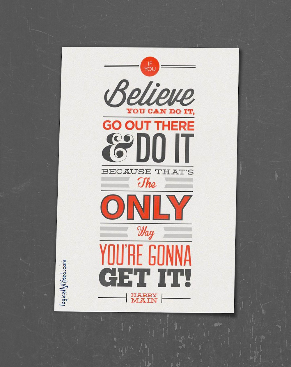
The poster feels professional and organized because the designers used a consistent margin width around the text. As you go from one line to another, your eye knows exactly where to look.This is a great way to make the actual text just as compelling as the message.
So if you’re thinking about taking a similar approach for your inspirational poster or just want a creative look, I recommend using a consistent margin width.
8. Feature a bold color scheme to attract attention
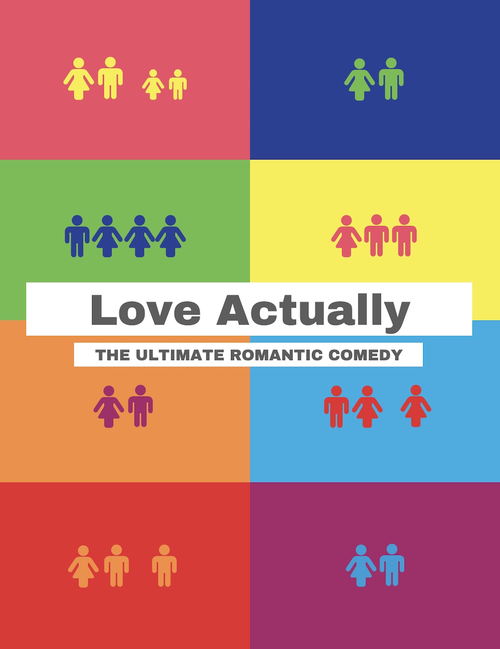
If you haven’t been paying attention, you may have missed bold color coming back into the mainstream. After seeing ultra-minimalist designs dominate the last decade I’ve welcomed color back with open arms, especially on posters.

In this poster example, the designers used 8 bold colors to help the design stand out from other posters. I could see this poster on the wall of any dorm or school. The designers knew they were going to need a ton of bold color to get the attention of those darn millennials.
9. Pick a creative poster idea that reflects the theme
Making design choices that don’t fit the idea, theme, or topic of your creative poster is a common mistake that a new designer will make. Heck, it’s a mistake that I made in my early design days.
For example, since Europa is a moon off of Jupiter it would need a sci-fi or futuristic theme.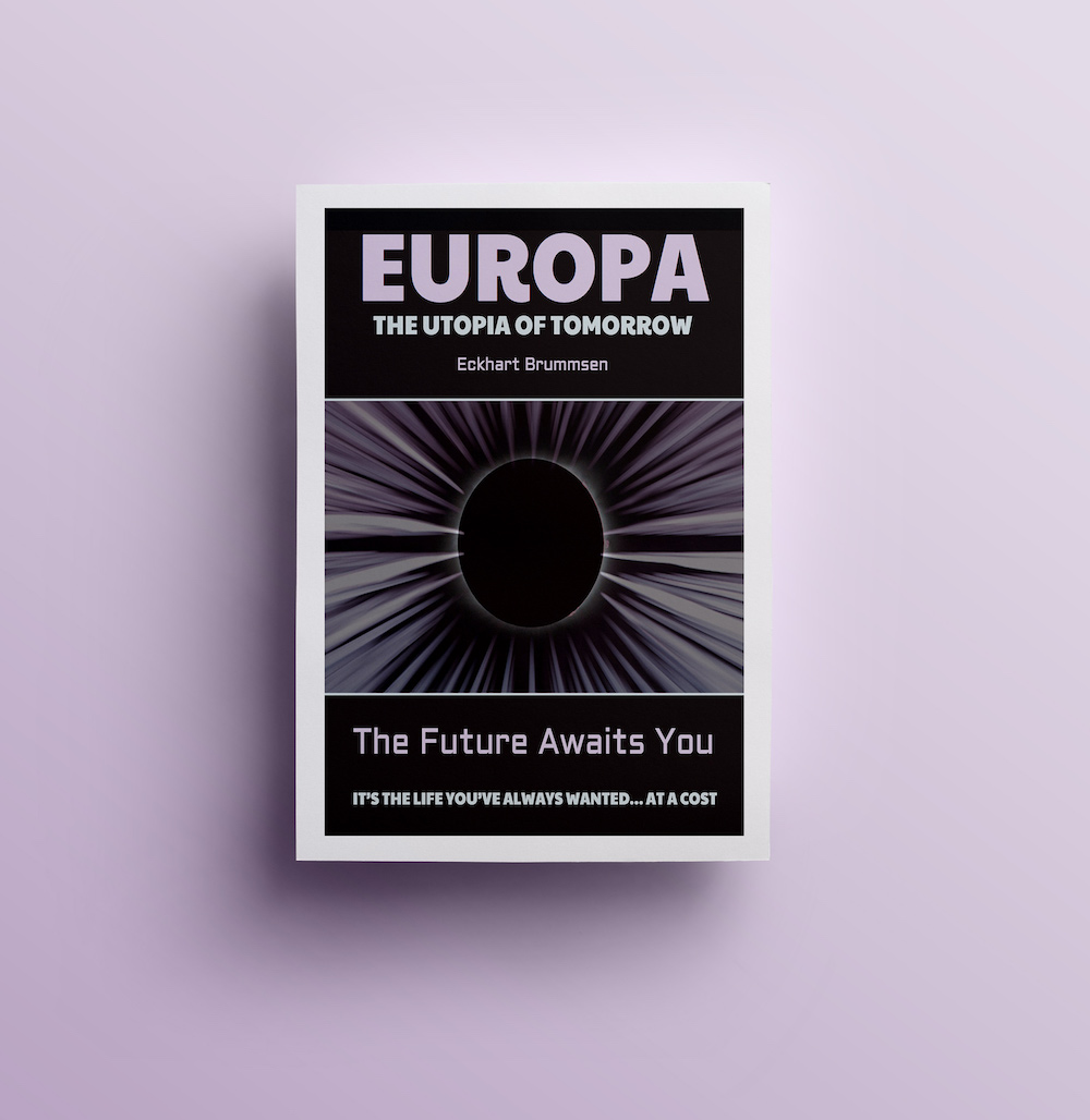
A fun font and colorful palette would not have the desired effect. And frankly, look out of place on a poster about space.
10. Divide your poster layout in half to contrast “before” and “after”

A common marketing tactic is to show how your customers’ lives are before and after they buy your product. Think about all the ads that you see on TV that show how your life will be better because of their product (even if they don’t always tell you what their product actually does.)

The same idea can be used while coming up with a creative poster idea. In this poster example, the page is split in half to show the “before” and “after” effect of being an organ donor.
11. Look for creative ways to incorporate product shots into your poster design

Whoever created this product poster for Nest did an incredible job! They flawlessly blended a three-dimensional product right into the flat poster design. And best of all it doesn’t look overly promotional, or even out of place.

Now, maybe you don’t have a product that can be inserted into a poster so effortlessly like this. But you can use it as the background image, or even as the main focal point on your poster. All it takes is a little extra creativity, and you will be golden.
12. Upgrade a simple poster with bold shapes and patterns

Never use a raw stock photo. There are too many vague stock photos out there that do nothing to help your marketing collateral stand out.
This is a great rule of thumb when it comes to creating posters that succeed. Now you can start with a stock photo as your base, but you should make it your own before anyone sees it.

In this poster from Hami Miharu Matsunaga, they do just that. All it takes is an eye-catching pattern and some bold colors to instantly turns a nondescript photo into an interesting event poster.
13. Organize your poster into blocks to give it structure

When designing a poster with lots of components, like an event poster with lots of names, sometimes you have more information than you know what to do with.
To help keep your poster design organized, divide the page into “block” sections, like in the concert poster example above. The clean lines make it easier to scan the poster for important information!
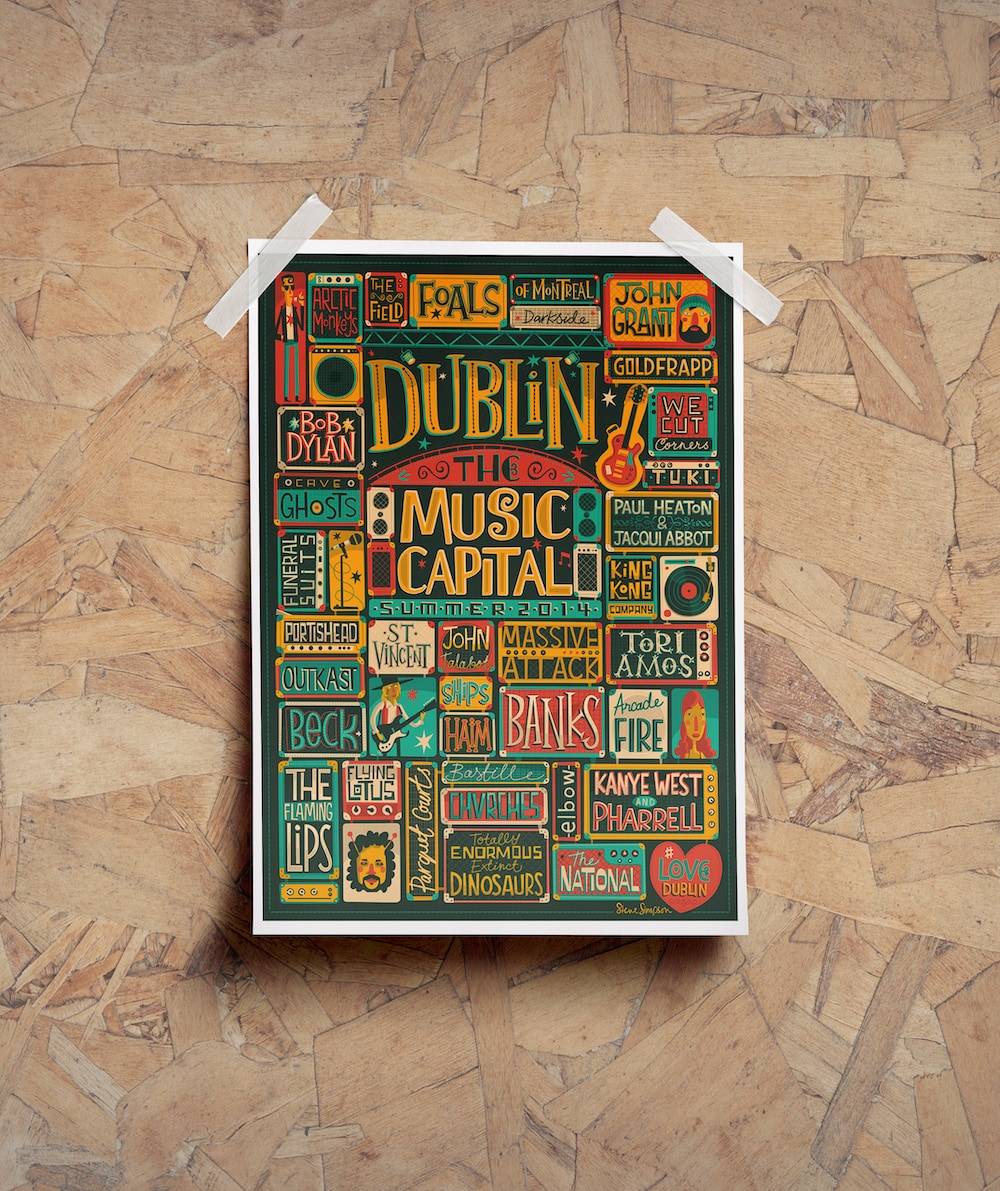
Without these sections, you would be left with a mess of band names, and some annoyed fans. So follow their lead and make sure you keep things well organized.
14. Use icons to direct the eye to important information

We have already talked about using leading lines to direct the eye in the right direction in a previous poster example. Well, this tip is similar: use icons to point to important information.

If the icons you select already look like arrows, like above, then you are made in the shade. These pointing shapes are called “directional cues”. It doesn’t really matter where you look on this poster, the icons are pointing you towards the center.
15. Create event posters for the day of the event as well
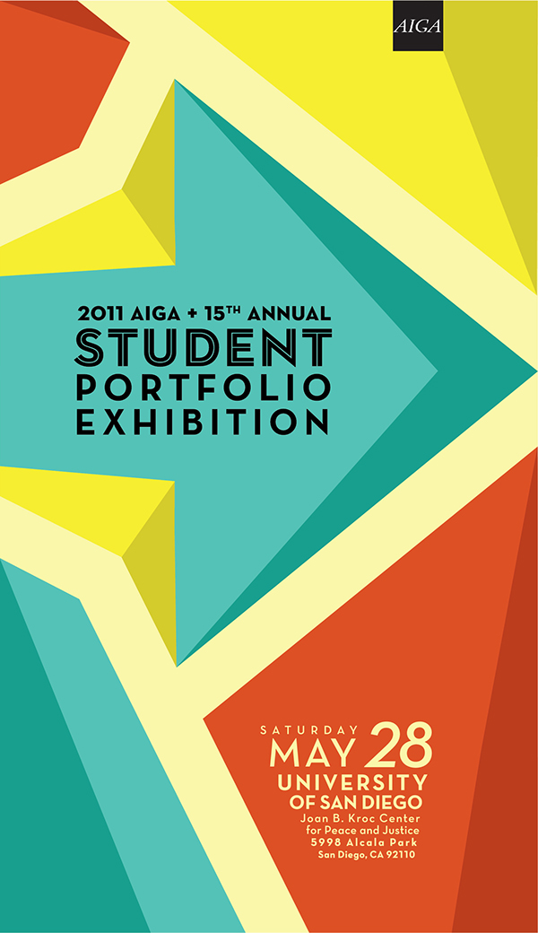
Most event posters advertise a certain event for many weeks or months in advance. I mean, almost all of the examples that we have featured in this roundup are like that.
However, you’re going to need posters on the day of the event as well. For example, this poster would probably be used the day of the event to point out where the actual festivities are.
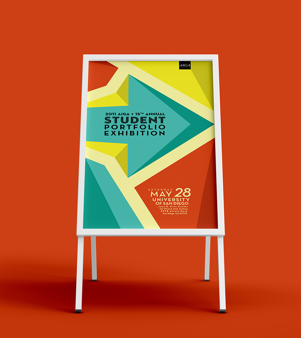
Others could lists rules, a schedule or something that helps the event attendees out during the day. So don’t forget to create those kinds of posters before its too late!
16. Include a visual gag or pun, it never hurt anyone

If your creative poster idea can cause an emotional reaction, people are likely going to remember it.

You can achieve a positive reaction by not taking your poster design too seriously. And secondly, by using a visual pun or gag, like in the informative poster above. I know I’m going to remember this poster for weeks to come, mainly because it was so punny. I bet you will too.
17. Include a transparent shape to give the poster template depth
If you want to add some depth to your flat poster template, then this example is perfect for you.
The designer gave this poster extra depth by using a simple transparent shape. With a strong background image and a bold color scheme, this creative poster idea will stand out from the pack.

I think that a solid shape would not have had the same appeal, and instead made the poster flat and nondescript. But instead, the background image is able to filter through and give the poster some unique texture too.
18. Blend your topic into your font choices, or create your own

There are no rules out there that say you must use a premade font to bring your creative poster ideas to fruition. Sometimes you need to create a font from scratch, and with our collection of icons, you can create do just that!
We have already seen how a designer used related icons to create a dolphin from scratch. You can use the same general idea to build your own custom font as well.

For example in the event poster above, the designer actually uses musical graphics and icons to build an interesting font.
19. Use a solid background shape or border to make text pop
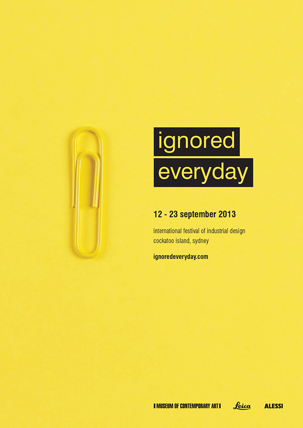
If you want to make text jump off your creative poster, follow the example above. They use solid black blocks to make the title text stand out. It also shows the reader where they should look first, which is always a plus.
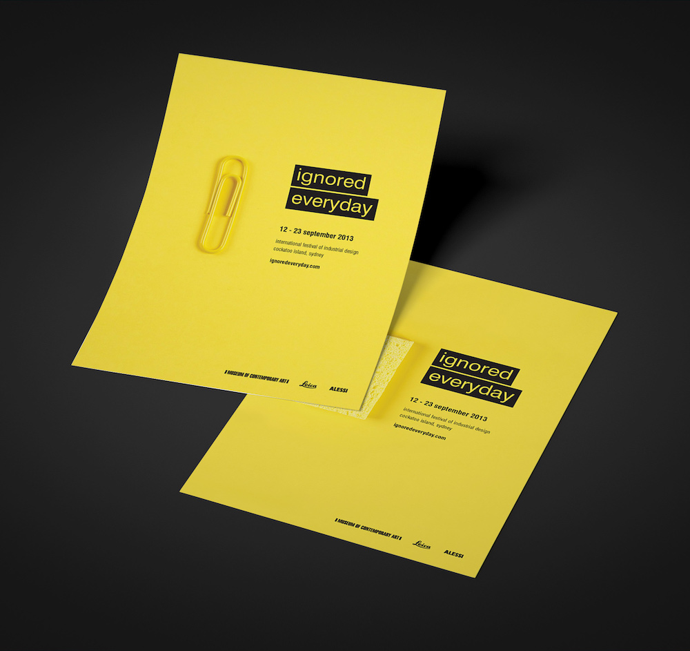
Additionally, this tactic can highlight a date, a website, or something important on your poster. Just be sure to use this trick sparingly, or it loses its effectiveness.
20. Include clever design choices to stand out in this busy world

This creative poster looks like a mess of random shoes, right? Well, it is, from this angle.
But if you take a step back, you can clearly see that the shoes are actually spelling something out. It’s almost like one of those magic picture books that dominated the 90s.
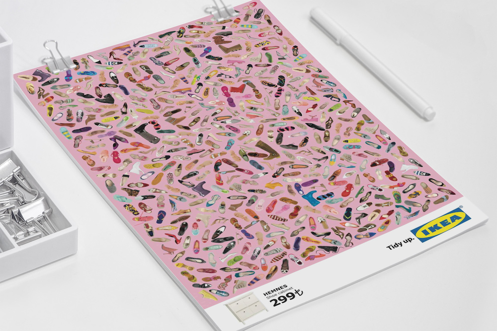
And this creative poster idea will definitely catch someone’s eye as they are walking by. It may actually cause them to do a double take and come back to it. If that’s not an effective poster, I don’t know what is!
21. Highlight an object that everyone will recognize
Creative posters that reveal their complexity over time will have a lasting impact on your audience.
For example, if you took a quick glance at this poster you would probably see a grail. This object happens to be what they are searching for in this installment of Indiana Jones. Even the most casual fan, like myself, would recognize that imagery from afar.

But when you take a close look at the rest of the poster, you see the profiles of Indy and his father form the grail. This a great way to feature various iconic objects that causal, and hardcore, fans will be drawn to.
And it happens to be a famous optical illusion!
22. Include a simple and memorable tagline

In this fast-paced world, you have to get your message out there very quickly and efficiently. That means sometimes the most straightforward posters are best.
For example, this designer created a very interesting poster by saying two things with a single phrase.

They were able to create a very unique and modern poster by keeping things simple. They could have said both of those things separately on this poster, but the impact wouldn’t be the same. And it wouldn’t have been an interesting poster in the slightest!
23. Create variations of the same poster design
In this section, you’re going to get two creative poster examples, for the price of one! Well, actually, they are basically the same event posters.
Both posters are a variation of the same design This is a fantastic way to design posters that fit different spaces and environments
The blue one might work best in a bar or coffee shop, but the red one fits a gym perfectly. Plus, in this case, the posters illustrate the competitive nature of the event perfectly! With one team using a red paddle, and others playing with the blue one.
24. Don’t be afraid of negative space

You don’t need to cover every single pixel of your graphic to create an interesting or creative poster. It’s good design practice to leave some negative space to allow your poster to breathe.

Especially if you’re trying to create a flat or minimalist poster, like above. As you can see in this example, the blank space actually helps the text pop off the page.
25. Make handwritten fonts the design focus of your poster

As brands try to become more genuine and lifelike, handwritten fonts will continue to be popular. They give each poster and design a bit of whimsy that other fonts don’t really have.
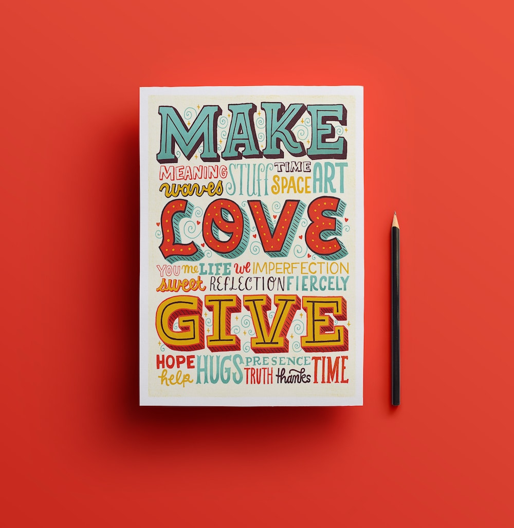
Take a minute to imagine how the example would feel if they used an ultra-modern font. I’m pretty confident that it would look out of place, and not have the same impact.
Especially if it was paired with a quote that can cause an emotional reaction, like in the poster template above.
26. Make sure all the important details are in one spot

Searching for a creative poster for important details, like an event location or time, can be a pain. If the key information isn’t easy to find, your poster won’t be doing its job effectively.
That’s why I recommend placing pertinent information in the same general area. Things like the date, a website, or the event location should all be in a single spot. Usually, the header or footer is a safe spot for this info.
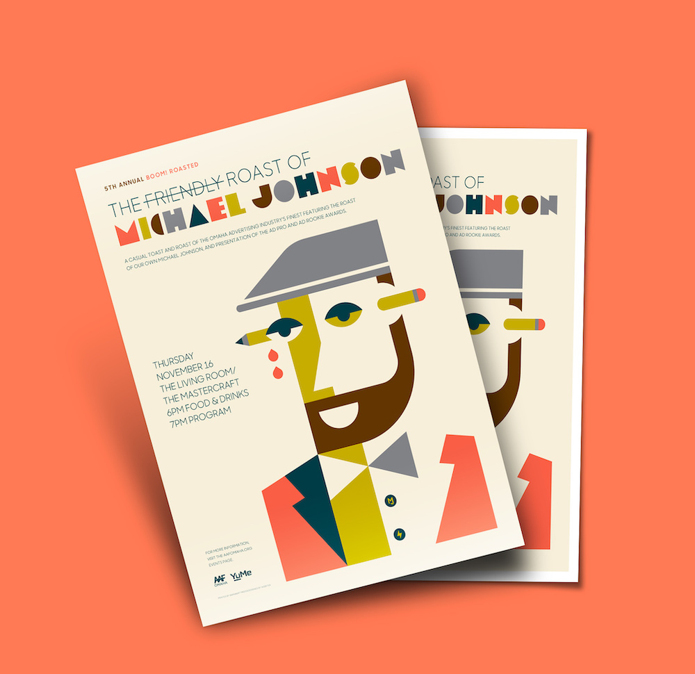
In this poster example from AAF Omaha, all of their key info is grouped together. They use negative space to make the information stand out from the background.
27. Visualize your event schedule or timetable with a timeline
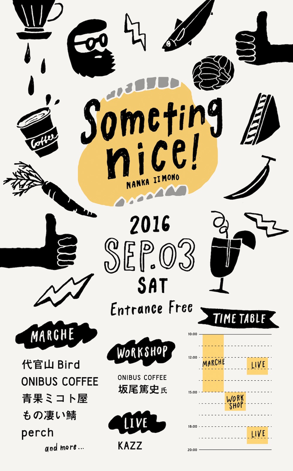
The designer for this poster decided to visualize the event’s schedule directly on the poster using a timeline.

They could have included a start and end time, like many other posters on this list. But this makes it easy for readers to know if any events are happening simultaneously.
28. Let the poster background image influence your design choices

Most of the time the poster background is, well, kinda fades into the background. But it doesn’t have to, and can instead be the focal point of your poster.
In the hiring poster above, the background image actually set the tone for the whole poster. From the font color to the poster structure, and even the way the text is oriented. And it all comes together to create a pretty unique poster.
29. Elevate your minimalist poster design with accent colors
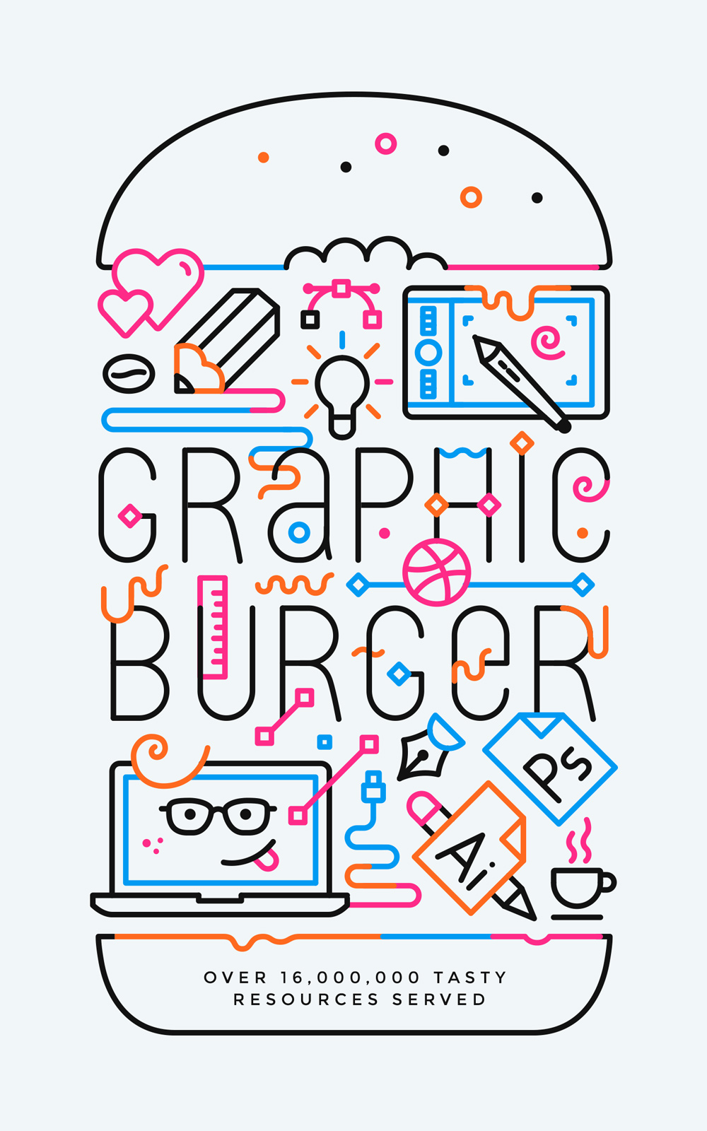
I think, one of the bigger misconceptions in the design world is that minimalist posters should have no color. However, minimalist design ideals focus on using the bare essentials to create something beautiful and functional. There’s no more, or no less used, just a perfect balance.
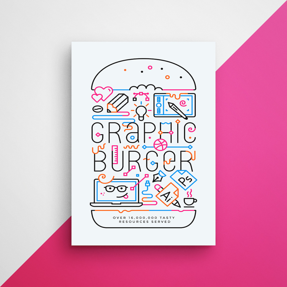
In this minimalist poster example, they do just that, with some accent colors to make it more eye-catching. This minimalist poster design could’ve been a boring line drawing if they stuck to just one color. But the pops of bold color help make it far more striking.
30. Use an infographic to tell a data-driven story

If you want to include some data or charts on your poster, I would recommend using an infographic as inspiration.
With an infographic, you can use graphs, figures, maps and charts to effectively tell a story. As you can see in the example above, they use all of these graphics in an interesting way.

All of these graphics come together to efficiently explain how Credilogic grew over the past decade. From the timeline infographic that explains their origin story to the graph that shows their growth over the year, and even the logo history.
If they were wanting to introduce their company to the community with this infographic-like poster, I would say they succeeded.
31. Use a landscape page orientation for a different poster design

As you may have noticed, almost every poster we have featured (and most posters in general) share one thing in common: they are actually all vertically oriented.

If you want to stand out from all of the other posters in the world, try using a horizontal–or landscape–page orientation. In the event poster example above, they do just that and it works very well.
32. Feature a single call-to-action on your poster
I’m guessing that if you’re creating a poster, you want a person to take an action after they read it. In the marketing world, we call that a call-to-action, and you should have one on almost every poster that you create.
This call-to-action could tell people to come to your event at a certain time or ask for a follow on social media.
In the creative poster example above, their call to action tells readers to visit a website for more information about the event. This is a great way to engage with readers on a more interactive platform.
Just remember to only have one call to action, or you risk confusing your audience.
33. Highlight an important piece of information with a contrasting font color

Sometimes all you need to do to grab someone’s attention is highlight a particular word or phrase. This phrase could be something like “Free”, “Act Now” or “50% Off.”
Or, in the case of this creative poster example, the word “Drink.” As you can see, this word is highlighted in a particular font color to make sure it jumps off the poster.

The designers know that people aren’t going to pass up the opportunity for free food and drinks, so they made sure readers can’t miss it.
34. Tell a story with images or icons, not words

It’s a well-known fact that your brain processes images a lot faster than text. And you can use this hack to make your creative poster a guaranteed knockout.
All you need is a few icons or graphics that can tell a quick story, like in the poster example above. However, try to only use recognizable or simple icons to tell your story. Nothing too technical or out of right field, or your readers will end up confused.

I’m guessing that you were able to decipher that this minimalist poster was for a winter jazz concert pretty quickly. But if not, they added some explanatory text below the icons too.
35. Improve almost any photograph with a duotone

Duotones hit the graphic design world hard last year, and seem to be sticking around for a while. This style became very popular because it allows a designer to add bold and bright colors to any image.
If you’re looking for a bold poster background, a duotone is perfect. Especially when you want to improve a stock photo. Or keep a consistent color palette throughout the poster, like in the poster example above.
36. Incorporate unconventional borders for a modern poster design
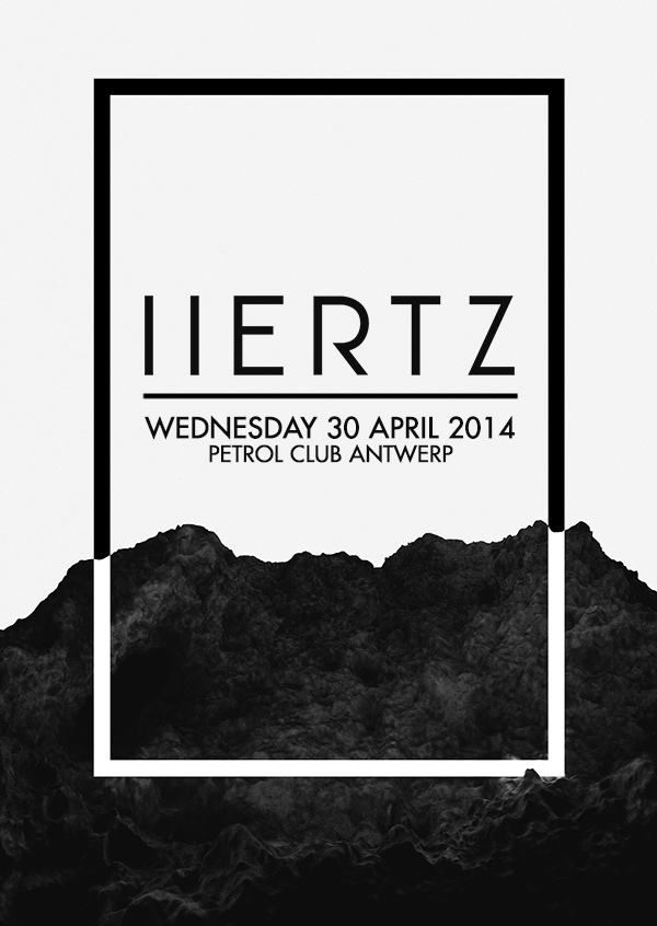
I would recommend featuring a border on all your minimalist posters, like above. It will help give the most basic poster some much-needed structure.
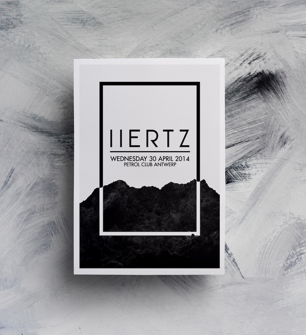
This border actually helps direct your eye to the important information on the poster. It’s functional and gives the poster a sleek modern look.
37. Change the reader’s perspective, literally

You may need to change perspective if you’re having trouble thinking of a creative poster idea. Start by taking a new look at a very common topic and you will have a ton of great ideas in no time.

In this example from IQ Agency, they take that idea very literally and design a memorable poster. Almost everyone knows the NYC skyline, that’s not unique. But when they flip the perspective and add some bold, partially obscured text, this poster becomes an instant classic.
38. Use hand-drawn illustrations to give your poster a playful feel
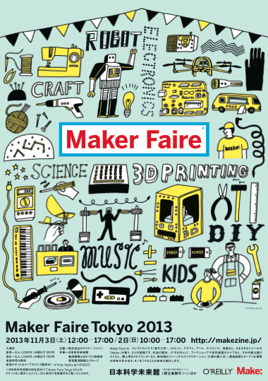
I’m a big fan of using hand-drawn illustrations for a lot of the same reasons I like hand-drawn fonts.
They both can add a bit of fun and whimsy to any poster. Plus, the icons can make the poster feel a lot more genuine, even if it’s created by a massive corporation.

If hand-drawn illustrations fit your brand, like in the example above, I would definitely use them as well. I can’t think of a better place than Maker Faire, which is filled with quirky creators, to use hand-drawn illustrations!
39. Combine multiple design influences for a truly creative poster idea
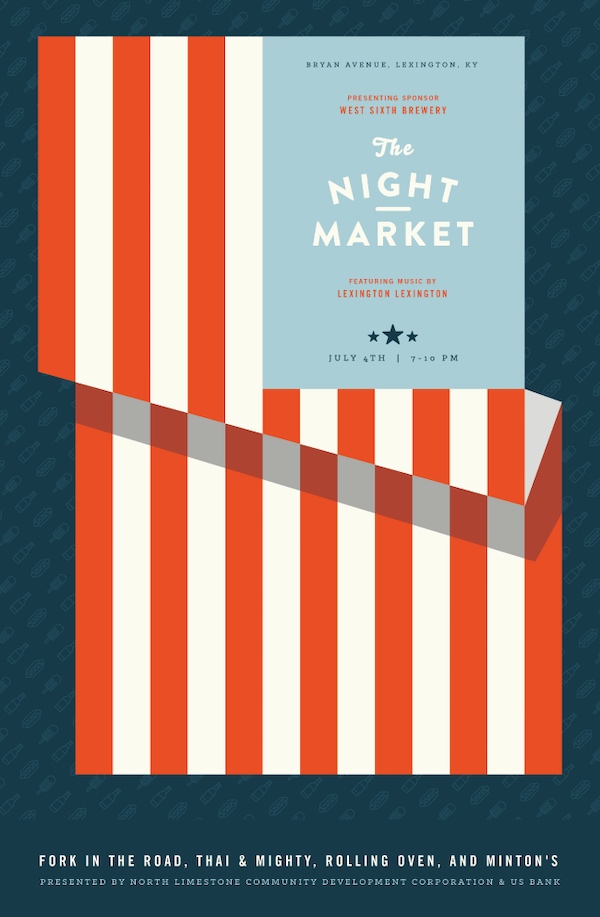
Now, I’ll admit that it took me a few viewings to see how amazing this poster is. But after I saw exactly what the designer was trying to say, I was sold.
The inspiration for this poster actually came from both the event, a night market, and the date it was being held on, the 4th Of July.
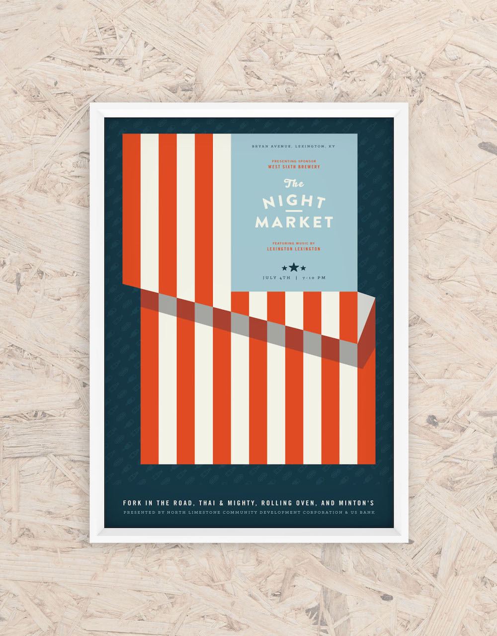
They then smashed those ideas together to create a killer poster. It has a vintage poster design feel, with the flag providing structure for the poster and then folding into an old school stall that you could find at the market. It’s perfect!
If you’re going to include a lot of info on your creative poster, I would recommend breaking it down into consumable chunks.
The presentation is really up to you and depends on the amount of info you want to share. You can use color, shapes, or borders to keep things organized.
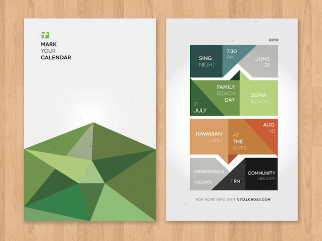
Or you could combine all of those design ideas like they did in the event poster example above.
Instead of just listing their event schedule on a blank piece of paper, the designers used color and shapes to beautifully connect it all.
41. Go ahead and pick an EXTRA bold color palette
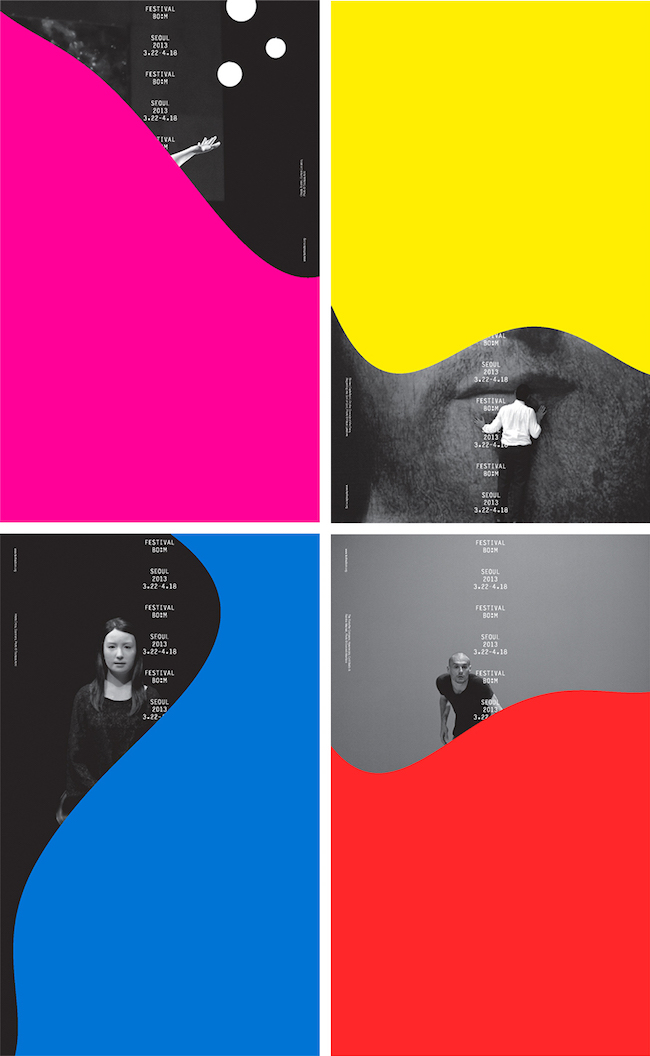
We’re going to end this collection with an example that I love. I actually saw this collection of posters a few months ago, and have been waiting to use it in an article.
The extra bold color was what initially caught my eye, and I’m guessing your eye as well.
But my favorite thing about this collection of posters is that you have to view all of them to get the whole story. The bold color and slightly obscured text create a sense of continuity between them.
Overall it’s one of the best creative poster ideas I have seen in a long while.
42. Present text or titles in a unique way

Sometimes to get your message out there, you need to think outside of the box. Especially when you’re designing a creative poster.
In this unique poster example, the designer decided to present the event title in an innovative way. Instead of going the traditional route, they presented the text across multiple lines. Then they used random breaks in the words to form an interesting focal point.
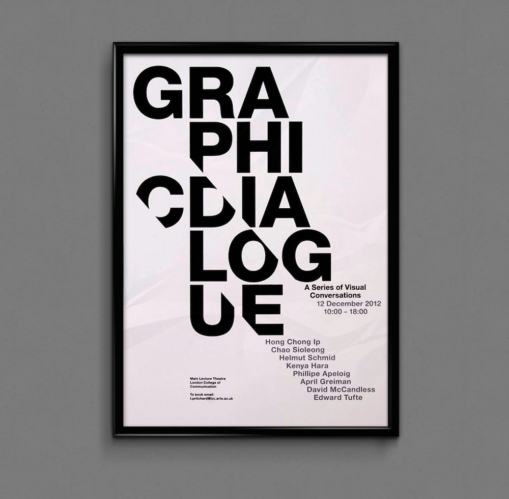
It may take someone a few seconds to read this poser, but it will definitely stick with them long after the fact.
43. Don’t use the whole canvas for your poster design

Just because you have a large canvas to work with, doesn’t mean you have to fill it up completely with content. When you look at any professional poster, you’ll notice the effective use of white space. It’s a simple way to avoid a disorganized look.
This designer decided to take that idea to heart and included a ton of white space on their poster. As you can see, almost half of the poster is blank! However, this white space helps the main content stand out even more.
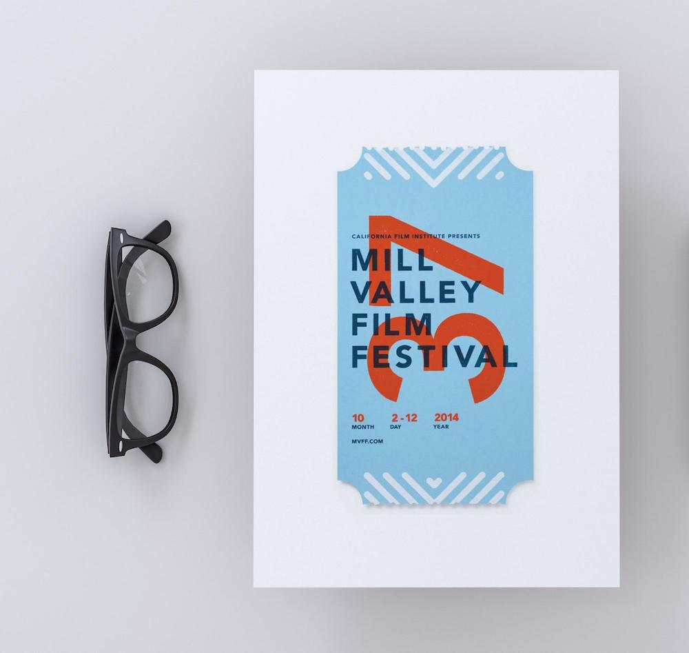
Without the open space, I don’t think the ticket theme would have been as interesting as well. But in this poster example, it almost jumps off the paper to grab your attention.
44. Create multiple versions of your creative poster

I don’t think anyone will argue the fact that most people have different tastes and preferences. This is particularly true when it comes to design, and art as a whole.
One group of people may love your creative poster idea, but the other may hate it. Now without even meaning to, you have turned off a large portion of your potential audience.
Because of this vast pool of potential readers and their varied tastes, I would recommend creating a few different creative posters. As you can see in the futuristic poster examples above, they designed 4 different posters for their single event.
This approach will hopefully ensure they appeal to a larger audience than they could with just one distinct poster example.
45. Upgrade a stock photo with flat icons, filters, and borders

One of my biggest design pet peeves is when people just slap a raw stock image onto their graphic. They don’t even take the time to add icons, borders or a simple color filter!
All of these things could have instantly upgraded the photo and made the graphics unique to their brand!

In this creative poster example, they used a simple border to give the image more structure and draw the eye in. And then they added a flat pink shape to make the text really pop.
Overall, they created a very engaging poster without using any gimmicks that distract from the message.
46. Add a splash of vivid color to your minimalism

Vivid color palettes are one of the biggest graphic design trends this year. With massive brands like Apple, Spotify and Google adding them to their marketing and design arsenal.
You can use these bright colors to add a little something extra to your minimalist poster. In the poster above, the creators used a vivid gradient to catch the eye.

Plus it fits exceptionally well with the simple design used throughout the rest of the poster. And this approach doesn’t abandon the minimalist ideals of using only what you need to get a point across.
47. Use a simple poster background that can easily be changed
In an attempt to stand out this year, some people will use very complicated poster backgrounds. Or they just slap a somewhat related stock photo on their poster and call it a day.
Complicated poster backgrounds work for some types of events, but sometimes it’s better to keep it simple.
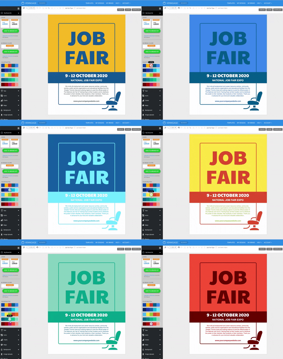
In this poster example, you can see that they used a simple flat background throughout the poster. As you can see, the information becomes the main focal point of the poster with this approach.
Best of all, with a flat background, you can easily change the color scheme of your poster to fit different situations. You can also easily reuse the poster template for future events this way.
Using Venngage’s My Brand Kit, all you have to do is click once to add your brand colors to the poster. With a second click, you can see swap where the colors appear, like so:
48. Make your text pop with layers and depths
Bold text is one of this year’s biggest graphic design trends. Mainly because this type of text will jump out and grab your attention and it looks amazing on our high definition screens. So expect to see bold fonts all over your social media feeds this year.
If you want to take your bold text to the next level, I would recommend following Nike’s lead. In this poster example, they separated their bold text into different layers and it looks incredible.

A poster example like this will definitely stand above the noise in real life and on social media.
49. Swap a letter with an icon or illustration

I have been a fan of this innovative poster example from the instant I saw it. From the minimalist design to the patterns, I liked every part of it. Plus it promotes an important and potentially heavy topic in a fun way.
But in my opinion, the replacement of the letter “O” with an icon is the best part of this example. With this swap, the designer wanted to make sure people knew that voting was a great way to make sure their voice is heard.

This simple design choice will ensure that their message is seen by a ton of people. I think it was a success because almost two years after its publication, people are still sharing this poster on social media.
50. Create a light and dark version of your creative poster


Twitter was one of the first tech giants to add a light and dark mode to their platform. Now almost all of the big tech companies include it with their app. They saw that they could improve their user experience by making things a little more flexible.
This is because depending on the situation, a light background is going to make things look better and vice versa.
When designing your poster, I think it’s important to keep that idea in mind. Sometimes your poster will be seen on a dark wall, and other times it will be seen on a bright white social media feed.
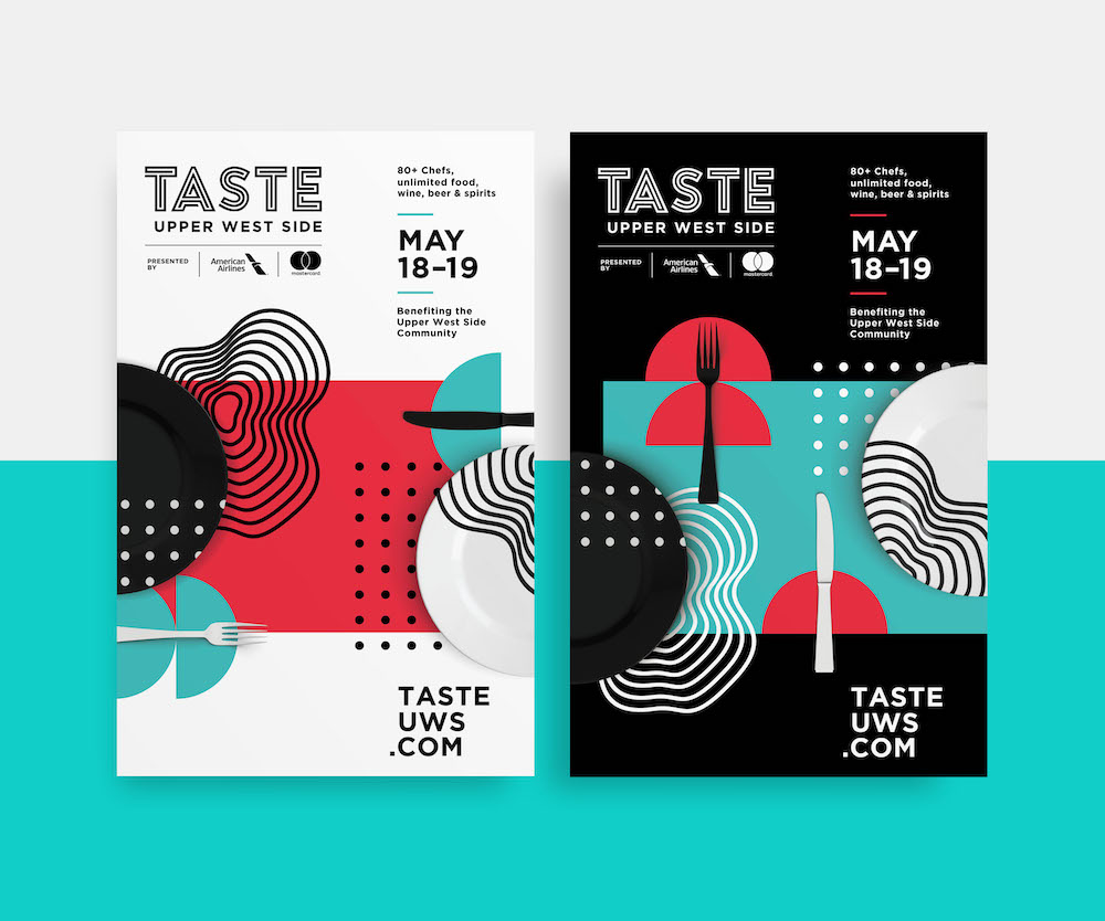
As you can see with this example, they created both a light and dark version of the same poster to make sure it looks great anywhere.
51. Use gradient fills in your poster designs


Gradients are a simple way to add a bit of color or excitement to your poster background. They are now super easy to use with Venngage–all it takes is a single click to add them to your poster.
But in this example, they decided to use gradients in a different way. Instead of placing a gradient in the background, the designer added it to all of their shapes.

In combination with a simple white background, the gradients add a lot of depth to the simple shapes.
52. Make sure your poster has a call-to-action
If you’re not familiar with marketing lingo, you may not know what a call-to-action is. Simply put, it’s a word or phrase that should inspire a reader to take action.
Most poster examples are going to have at least a simple call to action. Something like:
- Call 124-1424 For More Information
- Buy Tickets @ Tickets.com
- Visit The Community Center Now
- Sign Up Today!
These easy-to-digest phrases are usually the most important part of any poster. Without them, your poster probably won’t be effective because no one will know what you want them to do.
In this hiring poster example, they include a call to action at the bottom of the poster:
If the designer wouldn’t have added that section, the whole poster would have been a waste of time. And the company might be asking themselves why no one had applied to their job.
Well, without a way to get in contact with the company, it’s pretty hard to apply for a job!
53. For event posters, make sure your design matches the event

One of my biggest pet peeves is when event posters don’t match the event they are promoting. I find it more puzzling than intriguing when a book event poster looks like it’s promoting a dubstep concert.
Confusing your users from the start isn’t a great way to design a winning poster. So be sure to keep in mind what event you’re promoting throughout the whole design process.

In this retro party poster example, you can see that the design elements match the event perfectly. From the colors to the patterns and even the main font, this poster looks like it came straight from the 1990s! I also like that they added a CD icon to really increase the nostalgia.
54. Don’t use a boring background under your color filter

At this moment in time, there are millions of free images, stock photos and patterns in the world. With even more being added each day!
So why would you use a boring background image or pattern under your color filter? I know I wouldn’t.
Not sure exactly what I’m talking about? Check out this poster example, and you can see how powerful an interesting background image can be:

These flowers add so much color to the minimalist poster, all without distracting from the written content.
This poster is also a great example of a trend called colorful minimalism that I think will dominate 2019!
55. Break your poster into different sections with boxes & borders
There really isn’t a rule for how much information you can include on a poster. However, you need to make sure that this info is easy to consume, that the info is actually relevant to the poster and useful to the reader.
One of the easiest ways to keep your poster organized is to use boxes and borders. Now if you plan to include a ton of different information on your poster, try to emulate this poster example.
The designer actually broke this poster into 7 different sections using just a few lines and borders.
These borders make the poster a lot easier to read and navigate from one point to the next. Without them, the information would all run together, which is never good!
56. Always use high-quality images on your creative poster
If you’re planning on sharing your poster on social media or printing it out, be sure to use high-quality images.
In fact, always try to use high-quality images on all your posters. You really never know where they might be shared, or who will see them. It’s better to be safe than sorry!
Plus, readers are going to associate the images with your business from the beginning. If you use an odd or low-quality image on your poster, these same people will probably not want to work with your brand.
In this beautiful poster example, they definitely made the right choice with their featured image:
Not only does it fit the theme of the poster, but it will also look clear and professional on any screen.
There’s nothing more frustrating than putting a ton of effort into a poster, and finding out it looks bad on a large screen.
57. Make a creative poster design using icons
If you don’t want to include a photo or image on your poster, an icon collage is a great visual alternative.
I really like icon collages because you can get very specific with what icons you use. Especially because at Venngage, we have thousands of icons at your disposal!
In this sales poster example, the designer used a collection of clothing icons in the collage:
Each icon is different from the next, and it allows the brand to show that they have a ton of clothing on sale. With an image or photo, you might only get to include a few products if you’re lucky.
Plus because you can change the icon color, the collage can be used on other posters or design projects!
You made it to the end of our roundup of creative poster ideas! Great job!
Here are some key poster design tips to keep in mind:
- Use a color overlay for a more understated poster design
- Keep consistent margin widths on your poster
- Incorporate your product directly into your creative poster ideas
- Use directional cues like icons and illustrations to direct the eye to important information
- Design two complementary creative posters
- Group important information together to help it stand out
- Use accent colors in your minimalist designs
- Use hand-drawn illustrations on your poster design
- Go ahead and pick an EXTRA bold color palette
Get started on making your own poster right now
And if you’re looking for a little more info about creating posters I would start here:


