
If you work in HR, organizational charts are a lifesaver when you want to give an overview of company structure and reporting relationships.
Someone new join the company? Give them an org chart. Company starting a new project that requires teams that don’t know each other to work together? Give both teams an org chart!
One of the best ways to make org charts is Google Docs. Even non-designers can use it and the end product is easy to share.
In this blog, I’ll teach you how to make organizational charts in Google Docs and then reveal a better method using Venngage’s Organizational Chart Maker and organizational diagram templates.
Click to jump ahead:
- How to create org charts in Google Docs
- How to create org charts in Sheets and import into Docs
- How to create org charts in Venngage
- Conclusion
To create an organizational chart in Google Docs, follow these steps:
- Open a “Blank Document”
- Select the “Insert” menu and “Drawing” option
- Inside the “Drawing” tool, draw your org chart shapes
- Connect your org chart shapes using “Lines” or “Arrows“
- Add text to your org chart shapes
- Customize the appearance of your org chart
- Save and share your org chart
Got all that? If you want a detailed walk-through (with visual examples), keep reading!
A step-by-step guide on creating org charts in Google Docs
There are two ways to create organizational charts in Google Docs.
The first method require you to draw an org chart manually and the second is to actually use Google Sheets and import an org chart into Docs.
Which method should you use? The answer depends on your needs and skills.
Org charts in Google Docs are pretty easy to create when there’s only a few levels of hierarchy, but imagine having to draw 10+ levels!
Google Sheets is probably the better option for bigger, more complicated org charts with multiple hierarchies and nodes.
Step 1: Open a blank document
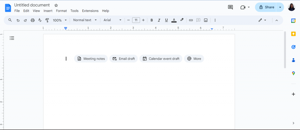
When you open Google Docs, select the “Blank Document” option on the welcome screen.

This should open a fresh document where our org chart will come to life.
Step 2: Click the “Insert” menu and select “Drawing”
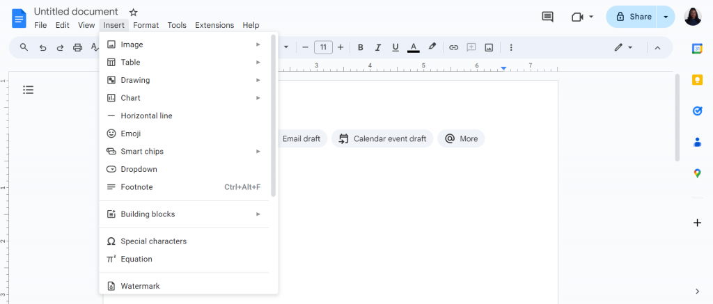
On the the menu bar of Google Docs, click on “Insert” and browse down to the “Drawing” option.
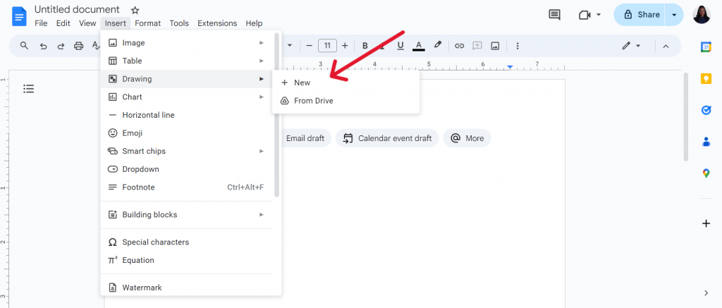
Make sure to click on “New“. This will load a blank drawing board where you can manually draw your organizational chart.
Step 3: Build your organizational chart
I’ll start by creating the foundations of my org chart using rectangles, although you can also use squares, triangle, rectangle and/or circle.
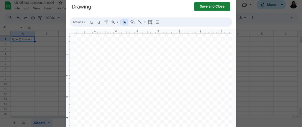
To draw a shape, click and hold your cursor. I drew a simple org chart to represent five people and three levels of hierarchy.
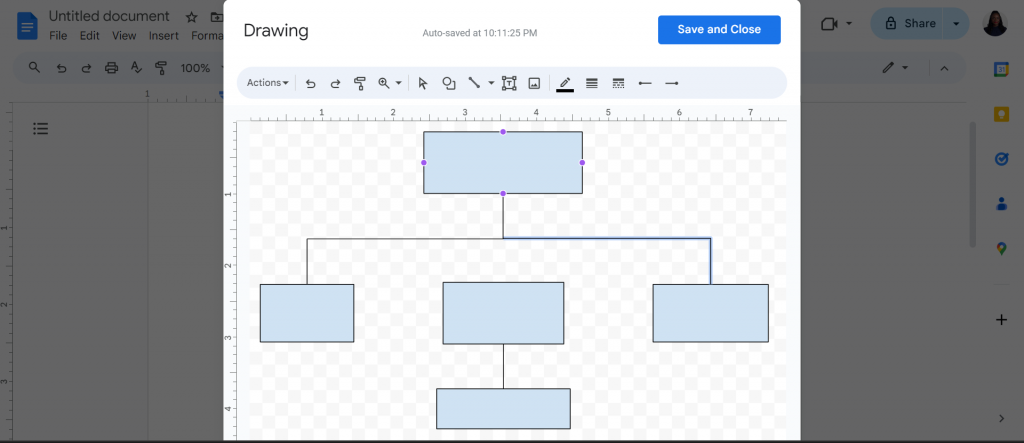
By the way, don’t forget to connect the different nodes or shapes together using the “Line” option to add lines and/or arrows to your organizational chart.
Phew! That’s already quite a bit of work. But let’s keep chugging along.
Now that we have the basic structure ready, it’s time to add text so that we can learn the name of people, their position, and reporting relationships.
To add text, click on “Text” box.
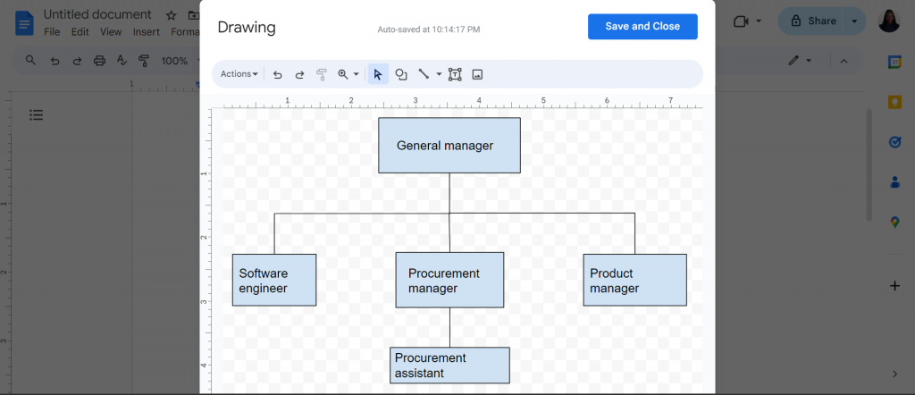
My org chart now shows a general manager at the top, followed by three managers who report to him/her, and a procurement assistant who reports to the procurement manager.
Though I didn’t add names of people, it’s always a good idea to do so.
Step 4: Customize your organizational chart
If you’ve come this far, give yourself a pat on the back! You’ve created a functional org chart in Google Docs.
Before saving it, let’s customize it a bit. This is an important step if you want to make org charts more visually appealing with color schemes or fonts that align with your branding.
You’ll also need to know how to customize org charts whenever there’s new hires, promotions, or people quitting.
To changes font style, simple select a text and then choose your preferred font from the dropdown menu, like this.
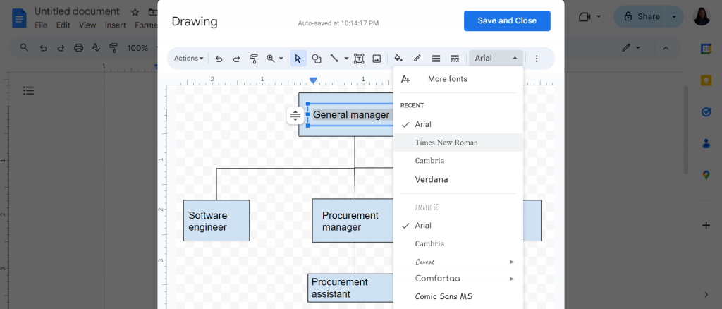
In my example, I changed the font to Times New Roman.
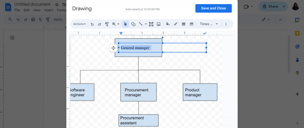
I also changed the color scheme in the chart by clicking on a shape and selecting a color.
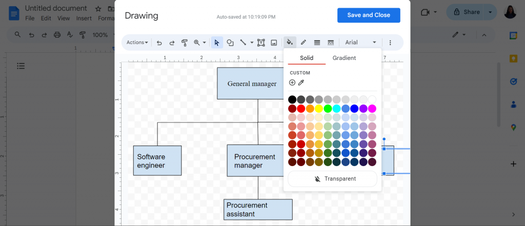
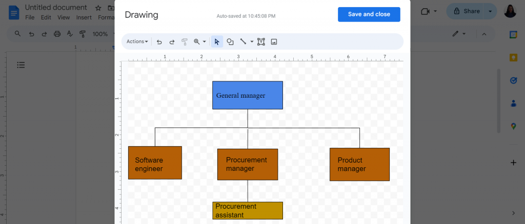
Notice how I use different colors for each level of the chart? This makes it much easier to tell apart the hierarchies visually than if the same color scheme is used throughout the org chart.
Step 5: Save and share your chart
Once you’re satisfied with your org chart, go ahead and save it.
Though Google Docs autosaves, make sure you click the “Save and Close” button in your Google Drawing so that it gets inserted into the document.
If you close Google Docs before doing this, you’ll lose your org chart!
How to use Google Sheets to create org charts in Google Docs
Now that we’ve seen one way of making org charts in Google Docs, let’s look at a more sneaky way.
I’m going to show you a hack where you can create org charts faster in Google Sheets which you just then import back into Docs.
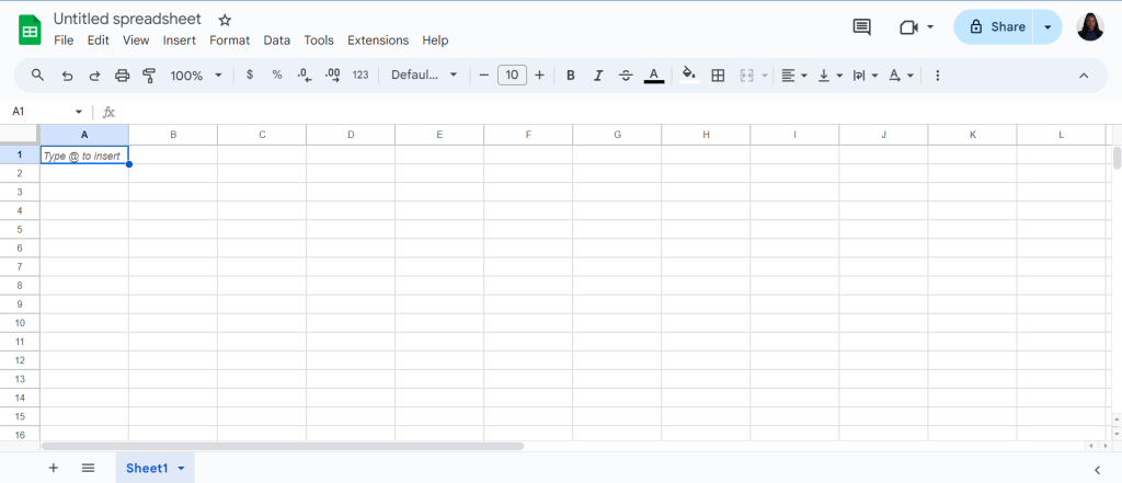
Step 1: Open a blank spreadsheet
Open a “Blank Spreadsheet” from Sheets’ welcome screen.

A blank spreadsheet should appear similar to this.
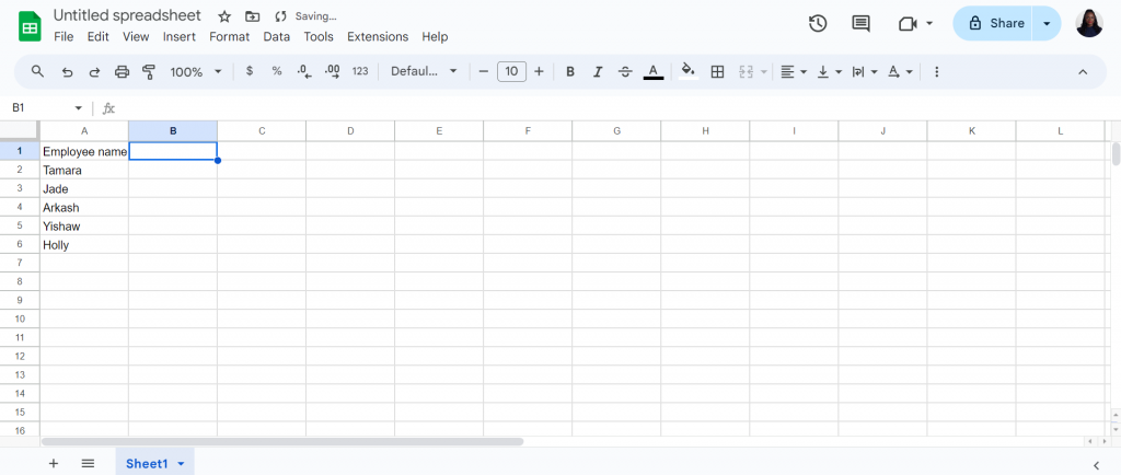
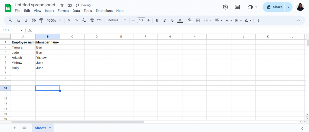
Step 2: Add “Employee Name” in column A
In column A, I’m going to add the names of all employees that’ll feature on my org chart.
Step 3: Add “Manager Name” in column B
Once you have the employee names down in column A, now it’s time to add the names of the people they report to in the second column.
Step 4: Select and highlight both columns
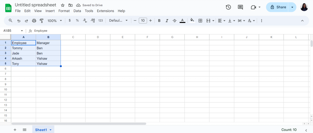
Now I’m sure you’re wondering how is entering data like this going to help me create an org chart, but bear with me.
Select both columns of data in Sheets to define the range we want Sheets to use to create an org chart.
Step 5: Select “Insert” > “Chart”
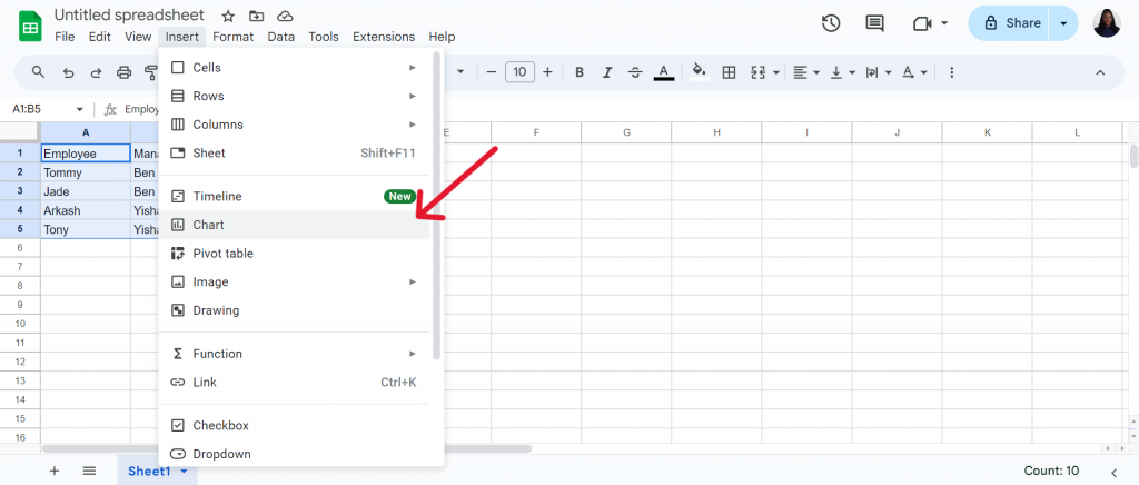
After selecting your data, click on “Insert” and then scroll down to “Chart.”
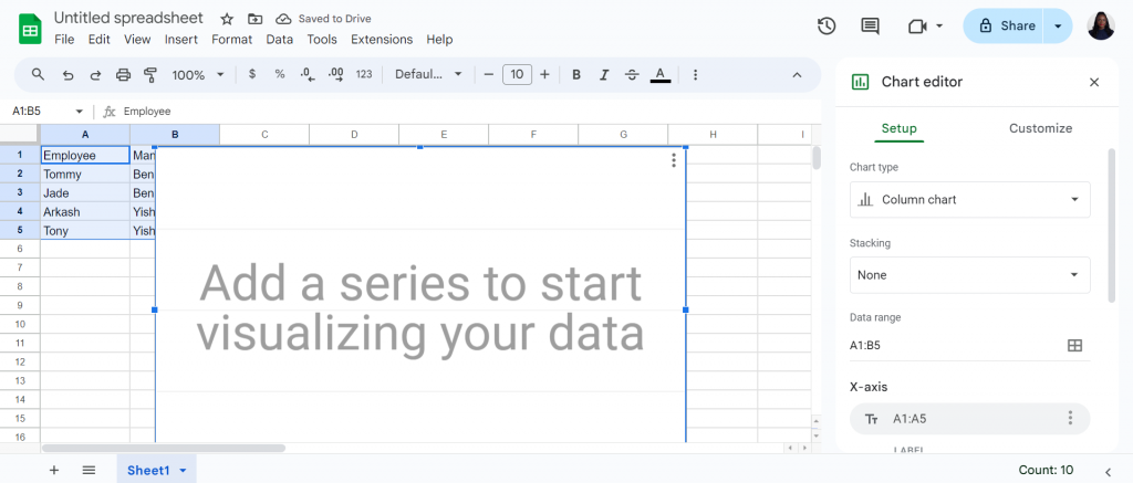
After you click “Chart“, Sheets will create a chart for you based on your data and side-panel should load like this.
Step 6: Select chart type
There’s no visual yet but that’s because the default chart type in Sheets is column chart which we don’t want.
To insert an org chart, click on the “Chart Type” option on the side-panel.
This should open up a new window where you can choose from several chart types, including organizational charts.
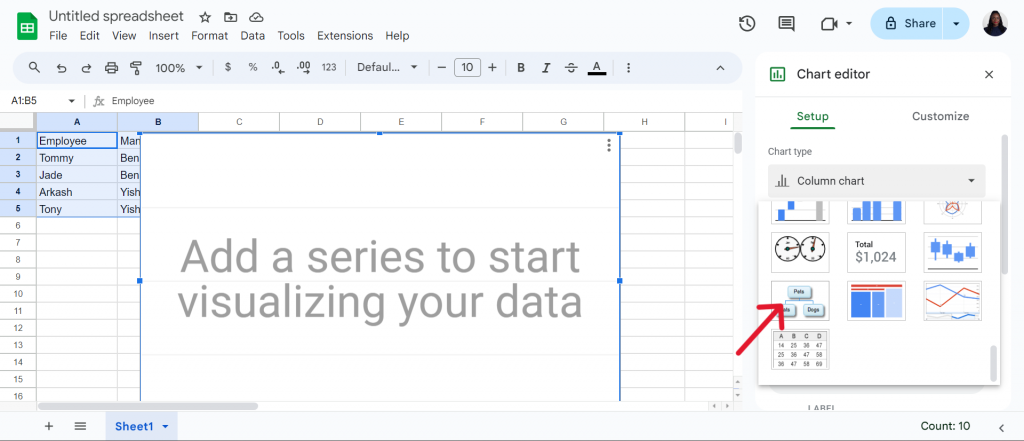
Step 7: Select organizational chart
Select the org chart option and Sheets will create the entire org chart structure for you based on the data.
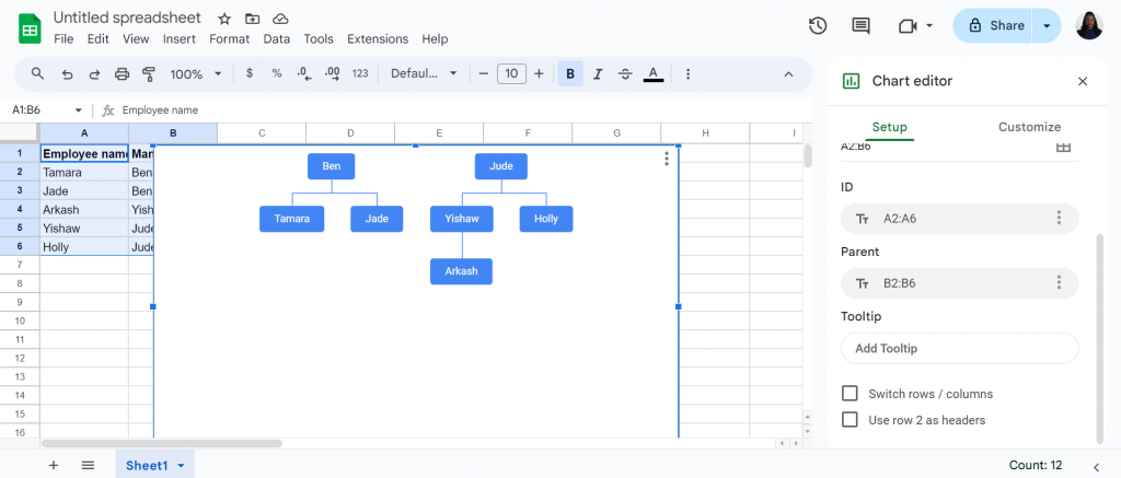
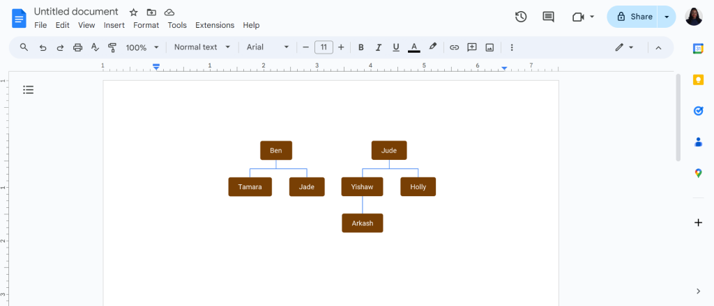
Step 8: Import the chart into Google Docs
Ready to bring your org chart into Google Docs? Here’s what you need to do:
- Open Google Docs and select where you want to add your chart.
- Click on “Insert” and then navigate to “Chart” and choose “From Sheets.”
- This will open a window displaying Google Sheets. Select the org chart you just created.
- Click “Import” to finalize, and voila! Your org chart is now in Google Docs.
How to create an organizational chart in Venngage
With Google Docs, the best you can hope for is simple organizational charts without fun and engaging icons and graphics.
If you want to add some life and color to your org charts, I recommend giving Venngage a try instead.
Our org chart templates are built by professional-designers which means you don’t have to waste time or energy trying to create them from scratch.
You also don’t need to be a designer to edit our templates. If you can use Google Docs to create org charts, you’ll be able to use our intuitive editor tool as well.
Here’s an example of an org chart template you can edit and make your own in Venngage in minutes.
Note: Some of our organizational chart templates are free to use, while some require a small monthly fee. Sign-up is free, as well as access to Venngage’s online drag-and-drop editor.
Step 1: Sign up for a Venngage account (it’s free!)
Sign up for a Venngage account with your Gmail or Facebook account. It’s free!
Step 2: Browse to our templates library and select “Diagrams”
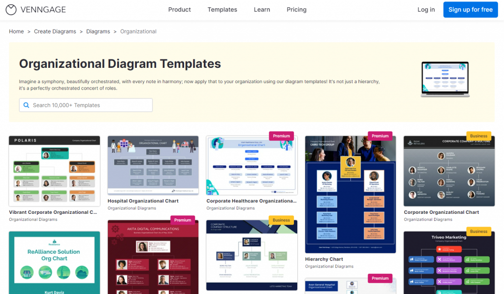
On our templates page, find the “Diagram” category page where you’ll find our collection of many types of diagram templates
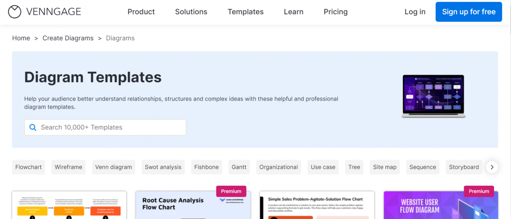
To filter for org charts, select the Organizational subcategory
Venngage has many types of organizational chart templates, such as hierarchical structure, divisional structure, team structure, etc.
Step 3: Customize your organizational chart
Venngage has tens of thousands of professionally designed templates that you can customize to suit your style and differentiate your company from others.
Let’s say you saw this template and wanted to edit it.
Just hit “Create” and the template will load in our editor where you can apply changes. Our drag and drop editor makes it possible to make changes in just a few clicks.
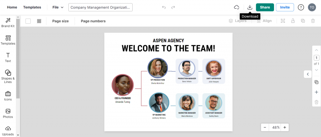
For example, if I want to swap the images to reflect people in my organization, it only takes a few clicks.
I just need to click on the picture, hit “Replace” and a side panel will load where I can browse our in-built library for icons/graphics or upload a photo.
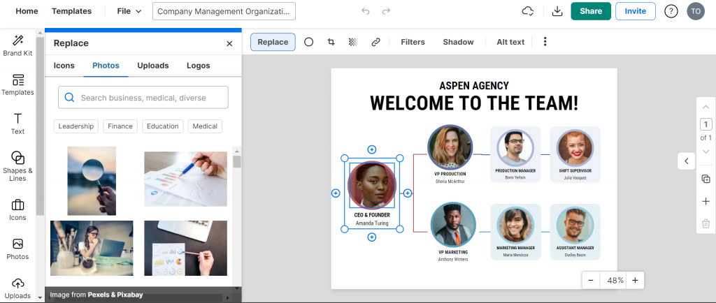
And when you insert it, the image automatically resizes and slots into the same place as the original. There’s no need to figure out dimensions or alignment.
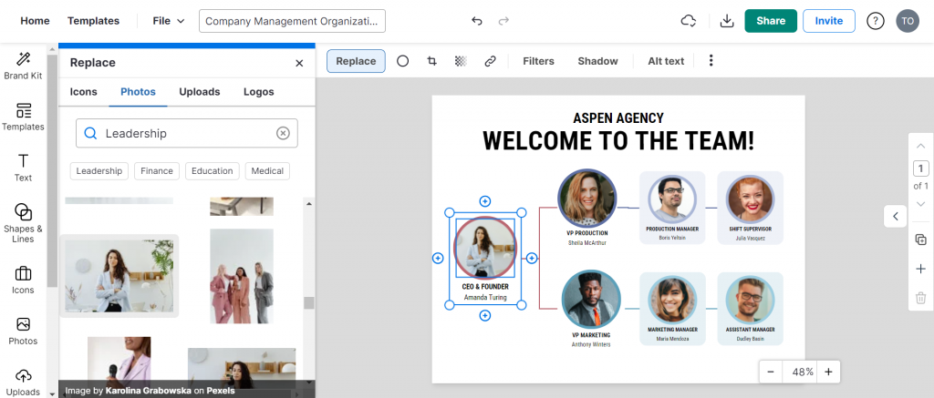
As you can see, Venngage allows even people without a design bone in their body to create colorful and engaging org charts.
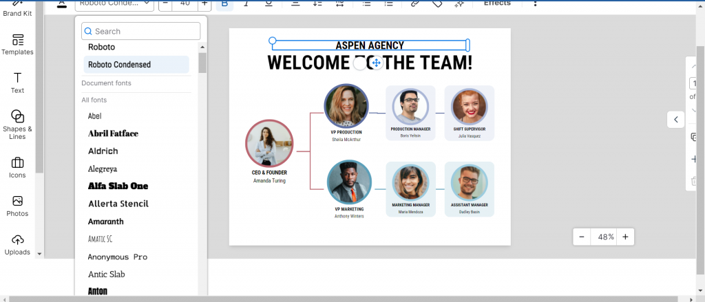
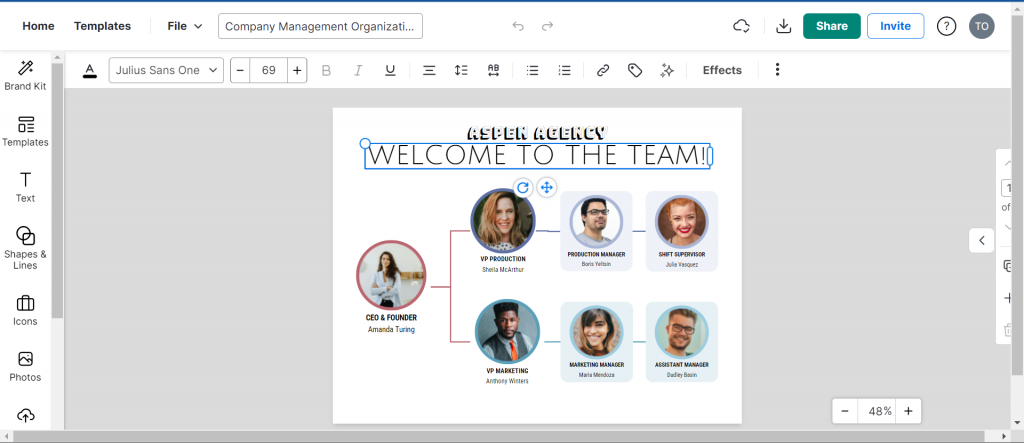
What if I wanted to change the template font to something more fancy? Well, that’s easy too!
Click on a piece of text and just browse for the font you want.
Our editor tool also has an accessibility checker built tool that lets you test if your org chart designs meet accessibility standards.
To test a design, click on “File” select “Accessibility” then click on “Check Accessibility”.
Let’s look at some more org chart templates that you can make your own with Venngage.
Here’s a hospital organizational chart that shows the line of reporting. It features relevant illustrations such as patients and an ambulance to enhance its effectiveness.
This organizational chart shows the executive officers of a company at a glance. Notice how the org chart uses Netflix brand colors of black and red for maximum impact.
This marketing organizational chart shows the company’s hierarchy in a simple way. The use of color coding helps to differentiate between levels of hierarchy, with the president in green, VPs in blue, managers in red, and the shift supervisor in purple.
This non-profit organizational chart shows the positions and people who occupy them at an NGO. The chart includes dashed lines connecting the Directors to their team members, indicating reporting relationships.
Step 4: Save and share your organizational chart
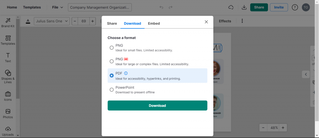
Once you’re happy with your organizational chart, you can share it with your team via a link (available to all users).
But if you want to download your org chart to include in a document or presentation, you’ll need to be on the Business plan.
Conclusion: Create fun and engaging org charts your company will appreciate with Venngage
Organizational charts are not only an educational tool but an indirect way to communicate company culture.
Do you really want to appear to be a company stuck in the 1990s creating black and white org charts or one that’s in 2024 with the ability to create colorful, engaging, and diverse org charts?
Check out our org chart templates and create one that you’re proud to share.


