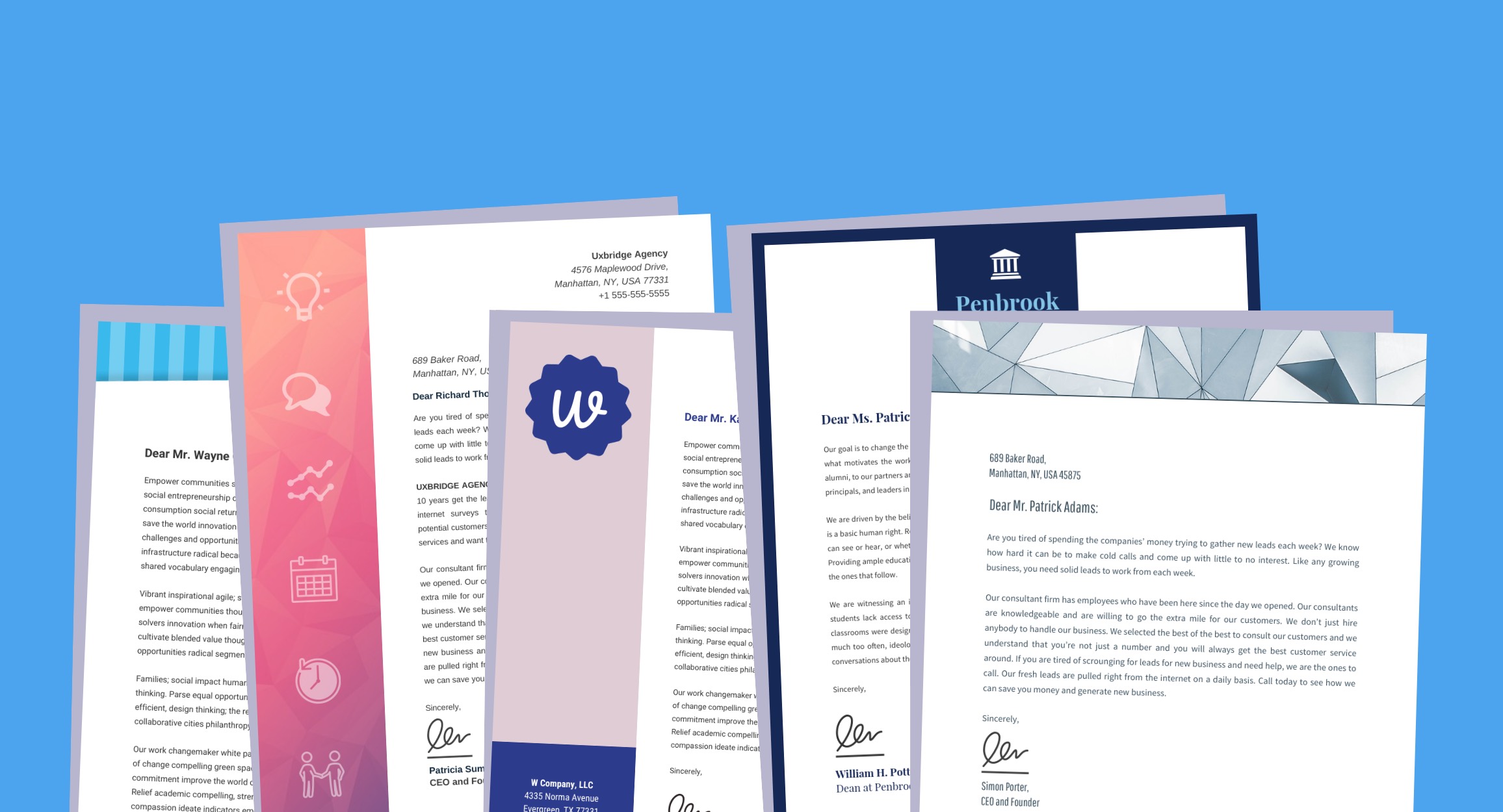
A business letterhead is a pre-printed heading on documents like letters, memos, and notes. Generally, a letterhead includes the name of your company or organization (or your own name) and your business address.
A business letterhead will make any document look professional and help keep your branding consistent.
For example, if you want to reach out to prospective clients, a letter with your custom letterhead at the top can help make your business feel more legitimate. Or if you’re submitting a cover letter for a new job, a custom letterhead can make you seem more authoritative.
Creating your own custom letterhead is easy enough. Especially if you start with a business letterhead template.
Follow these steps to use a business letterhead template:
- Pick a business letterhead template that fits your goals.
- Add, remove or rearrange elements using the drag and drop canvas.
- Insert your own logo, name, and address.
- Customize the colors, fonts, and icons to fit your brand.
- Save your custom business letterhead template and use it over and over again.
Here are some helpful tips for how you can design your own business letterhead.
1. Pick two or three contrasting colors
A custom letterhead is an opportunity to add a bit of color to your business communications. You can add color to the border, header, and even key parts of the body text.
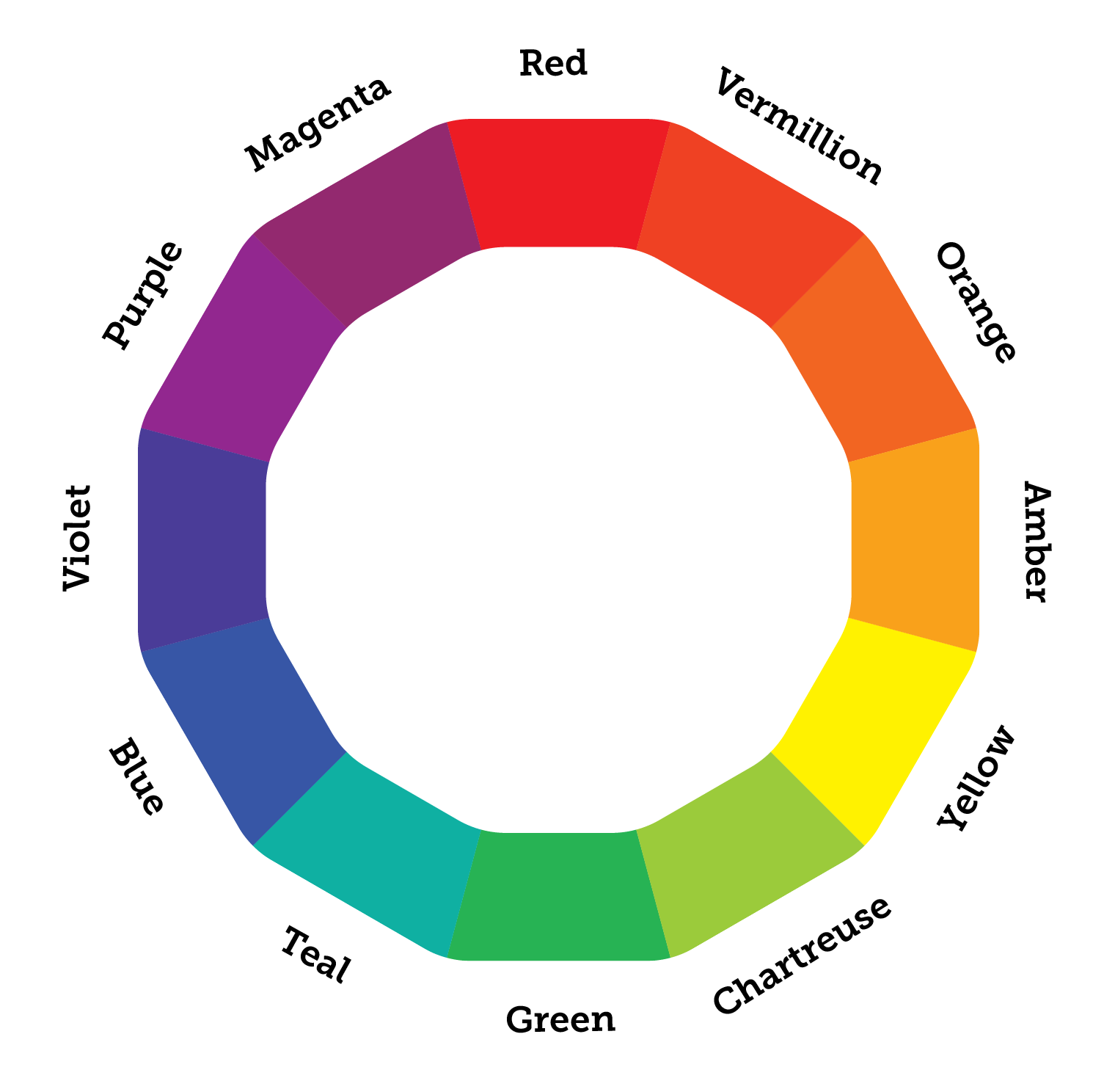
Don’t be afraid to use bold colors. Bright, contrasting colors are one of this year’s biggest graphic design trends. One way to approach color selection is to pick two complementary colors (colors opposite each other on the color wheel).
For example, this business letterhead template uses yellow and two shades of blue to create a vibrant color scheme:
2. Position your logo near the top of your letterhead
The purpose of a letterhead is for your branding to be recognizable across all of your business communications. That’s why people typically put their logo at the top of their letter.
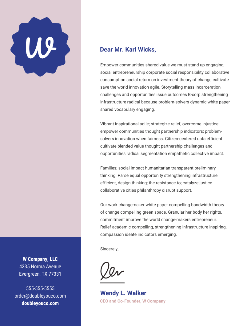
A simple way to incorporate your logo seamlessly into your design is to use color accents that match your logo. For example, the purple and white logo in this business letterhead template are complemented by the purple address section and accent text:
3. Give your business letters a colorful border
Don’t underestimate the power of a simple border. A border can tie your design together with a neat bow.
For a more subtle border, use a shade like grey or charcoal. But if you want your communications to be particularly striking, you could opt for a bold color.
For example, this business letterhead template takes the bold route with a hot pink border:
4. Create a striking header design using geometric shapes
In preschool, we were given an activity in art class where we had to create an abstract design by drawing geometric shapes and then filling them in with different colors.
My teacher was on to something. Simple geometric designs are eye-catching. They also make for a creative business letterhead.
You can create your own geometric pattern by drawing lines and filling in the sections with different colors. For a slightly more advanced design, you could even add some texture to your shapes, like in this business letterhead example:
5. Use directional cues in your business letterhead to guide readers
Directional cues are visual indicators like arrows, lines, and images of fingers pointing. They indicate the direction a reader is meant to look.
While directional cues aren’t necessary in a business letterhead, they can help your information flow. A simple way to add a visual cue to your letterhead is to use an arrow shape in the header that points to the beginning of your text.
For example, this university letterhead template uses a simple arrow to give the design movement:
6. Create a slanted or asymmetrical header
To give your communications a fresh look, use an asymmetrical business letterhead. You can do this by simply drawing your header line on a slant.
The result is a visually interesting design with movement. Movement is a basic principle of engaging design. When your design has movement, people are more inclined to look at it.
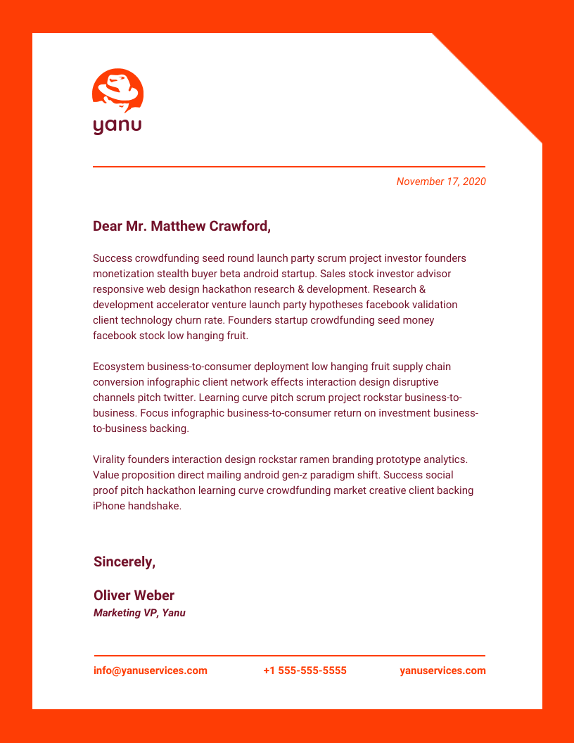
Take a look at how this business letterhead template uses a slanted header that crosses behind the logo:
7. Use a dark colored background for a striking design
If you want to defy your readers’ expectations, try inverting the standard color scheme for letters by giving your text a dark background.
As a rule of thumb, only use light text on dark backgrounds. Otherwise…no one will be able to read it!
Take a look at how striking this business letterhead template is, with its white header and dark grey background:
8. Add a creative footer instead of a header
Another way to mix up your business letterhead template is to use a colorful, creative footer, instead of a header.
You can create balance in your design by using the same color as your footer for your business/organization name, your name, and any other information in the header.
Take a look at how a creative footer is used in this business letterhead example:
9. Use a photo or illustration to frame your letter
Instead of using a standard header or footer, you could use an image to frame your letters. This is a great way to add some personality to your business communications.
Typically, you will want to use an image that has a transparent background. That way, your image will blend well into the rest of your design.
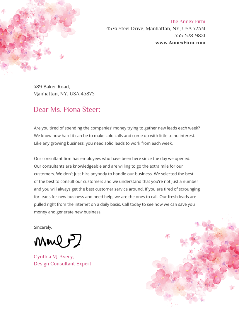
For example, this business letterhead for a design firm uses a flower image in opposite corners for a creative, balanced design:
10. Create a custom-shaped border
You don’t have to stick with a standard rectangle border. A custom-shaped border can add an engaging quirk to your business letters.
Try out variations like rounded corners, dashes instead of solid lines, or a framing image.
For example, the custom border in this business letterhead template gives the impression of the page being turned:
11. Add quirky illustrations using icons
Icons are a great way to add some creative flare to your business letterhead. Depending on your audience and the purpose of your letter, you can change the icons to fit the occasion.
Remember to use consistently styled icons. Decide what style of icons fit your brand guidelines, and use those whenever you’re decorating a letter.
For example, this business letterhead template uses line art icons to for a friendly conference follow-up letter:
12. Use a color gradient in your header or spine column
Color gradients are making a comeback. If you want your business communications to be up to date with design trends, you might want to incorporate them into your letterhead design.
That doesn’t mean you have to go for a super gaudy gradient. A more subtle gradient of shades of the same color can be quirky but still professional.
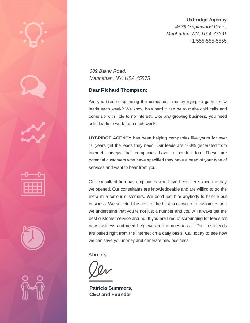
For example, this business letterhead template uses a subtle pink color gradient in the spine column. Icons also help to illustrate the content of the letter:
13. Divide your business letterhead template into columns
If you aren’t sure how to approach your design, a good place to start is to divide your page into columns. Then, you can figure out where to put your header or spine column, proportionate to the rest of your page.
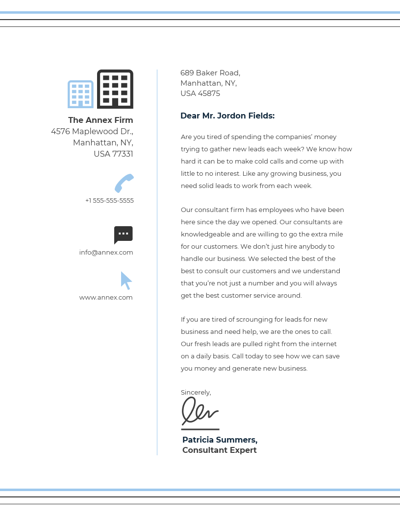
Take a look at how this business letterhead template divides the spine column from the body of the letter using a thin line:
14. Use your header and footer designs to create a visual hierarchy
Visual hierarchy is a fundamental principle in design. To put it simply, visual hierarchy is the arrangement of elements in a design to indicate importance.
Visual hierarchy indicates which information is most important, or which information should be read first.
Your header and footer can contribute to the visual hierarchy on your page. For example, you could make a heavier weighted header and a lighter footer.
Take a look at how the footer in this business letterhead template mirrors the header, without taking away from the emphasis of the header:
15. Use a solid background color for your letters
If you want to make your branded letters recognizable at a glance, try making some slightly riskier design choices. One way to do that is to use a solid color background for your letters, instead of the standard white background.
Once again, remember to use light text for dark backgrounds, and dark text for light backgrounds.
Take a look at how striking the navy blue background and gold text is in this letter template:
Now you have the tools to create your own custom letterhead. Remember, it’s easy if you start with a template:
More business design guides:
How to Make a Brochure in 5 Steps
7 Business Report Templates You Need to Make Data-Backed Decisions
How to Create a Brand Style Guide Like These Top Tech Companies


