Despite the growing popularity of digital marketing, traditional marketing brochures should not be overlooked. Brochures are good for making first impressions and provide a lot more information than a business card.
Now, what’s the last memorable brochure that you read? If you can actually remember it, it’s probably because it was exceptionally designed. Your design goes a long way in creating a lasting first impression.
If you feel overwhelmed by all the design considerations that you have to keep in mind, don’t worry.
Keep reading and by the end of this post, you’ll be more than prepared to create beautiful and highly effective brochures!
The best part is that you can use brochure templates to get the ball rolling.
The goal of a brochure is to:
- Act as a reference for the products and/or services your company offers
- Support sales efforts by improving credibility to answer any objections
- Generate leads for your business
- Establish communication channels with potential customers
The main purpose of your brochure is to motivate readers to take action. Whether that’s contacting your company or buying your product/service, they first have to give you the time of day to actually pick up and read your brochure! Make sure to keep these goals in mind throughout the brochure design process.
Start with brochure templates
Using a professionally designed brochure template saves you time and takes the guesswork out of creating the brochure outline by yourself.
Our amazingly talented designers created our brochure templates to suit many different types of businesses.
Use the following 12 marketing brochure templates and design tips to ensure that you create a memorable first impression and generate more responses!
1. Identify the purpose and strategy of your brochure
The first and most important tip that you should follow is to decide on the central purpose and strategy of your brochure. Putting in the time now to plan out your brochure will likely save you from wasting valuable time and money later on to fix any mistakes.
This process involves planning out who your target audience is, what most needs to be communicated to your audience, the central message, your brochure budget, and whether or not you need printed copies. This will help dictate the overall direction of your design and will ensure that the brochure matches your brand identity.
Lastly, you should have a clear view of your brand personality. This is to make sure all of your branding materials follow a consistent style.
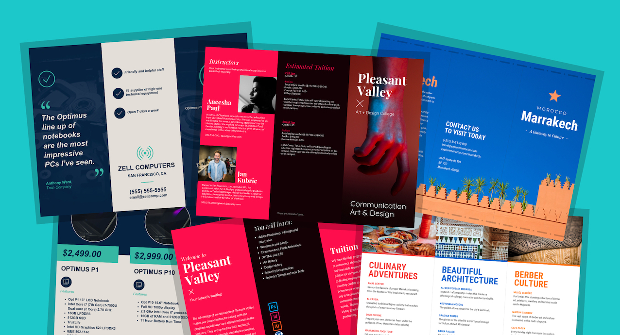
Take a look at the well-planned flow of this tri-fold brochure template for a college. The first section that the reader sees is an introduction to the college followed up by the value they offer to students. The reader is also shown the bios of the college’s professional instructors before reading the tuition details. This helps to make the tuition cost seem more reasonable by the time the reader gets to that section.
2. Focus on readability
Most people have short attention spans. You run the risk of losing readers if your brochure is too lengthy or difficult to read.
I understand how tempting it may be, but don’t list every single feature of your product or service. Rather, try to focus on your main selling points to grab the attention of your readers.
You should also stick to straightforward, simple language. Your credibility lowers with an increase in complex language. Don’t fall into this trap!
Here’s an example of a brochure template that follows this tip. It has clear and straightforward writing that helps to quickly get the message understood easily.
`
3. Plan out the order of information in your brochure template
Tri-fold brochures have a limited amount of space for information. If the reader is not impressed by the first section that they read, they most likely will not be compelled to read any further.
That’s why it’s important to only include information that any new potential lead should initially know about your company.
What’s so special about your company, product or service? Show it off early to hold their attention.
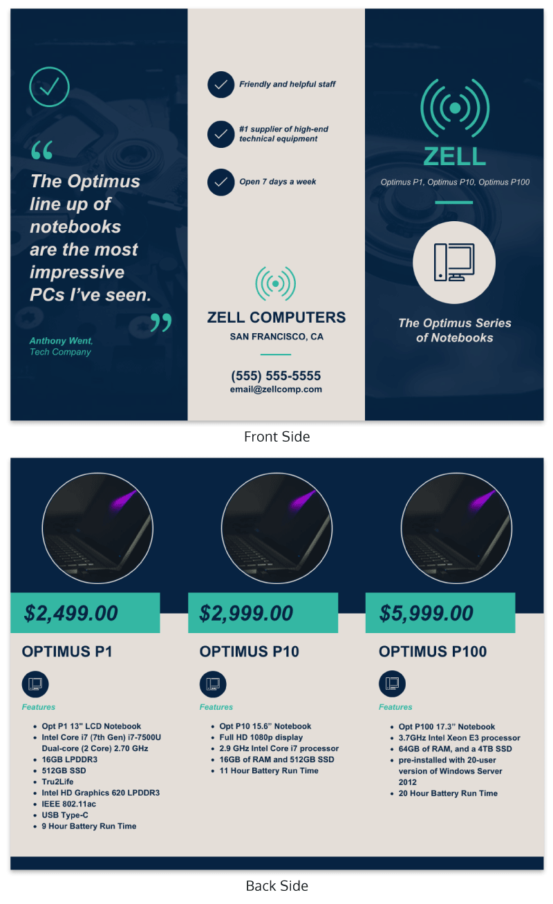
Sometimes it just makes sense to cut to the chase. This brochure template features a computer store selling a line of notebooks. Readers of this type of brochure want to know two things: the features and prices of the laptops for sale.
4. Choose relevant colors
Your choice of colors has a considerable impact on the initial perception your readers have about your company.
A general rule of thumb is to use any signature colors that the branding of your company may already have. From there you can incorporate other complimentary colors.
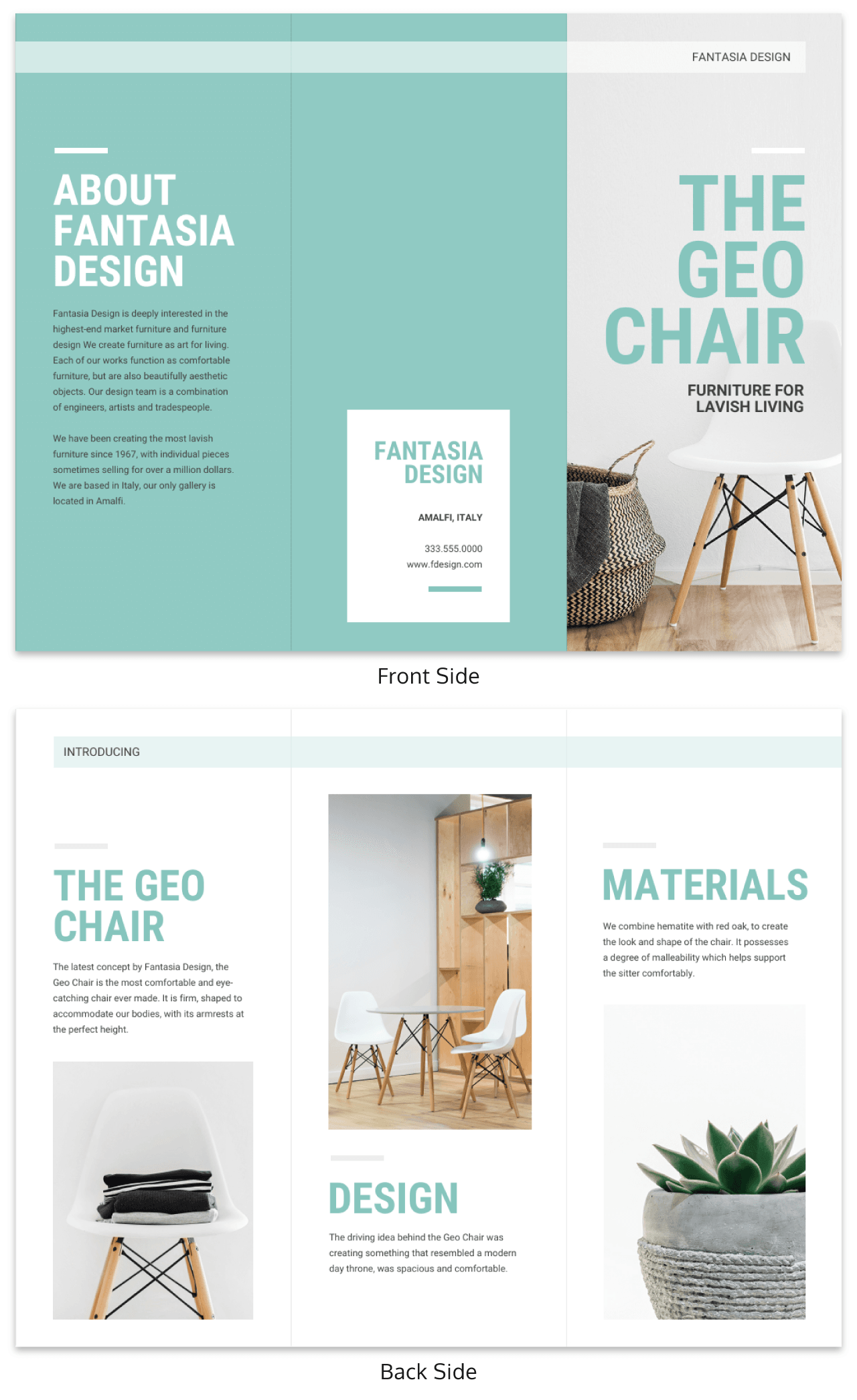
Certain colors just work better for different types of companies. For example, the pastel green used in this professional brochure template perfectly suits a home decor business.
5. Use consistent images
The use of consistent imagery throughout your brochure, similar to your color choice, is crucial to creating a professional looking brochure.
You’ll want to use relevant images that incorporate well with the overall theme of your design.
Feel free to use stock images but make sure they directly relate to any passages of text that they accompany. Just make sure to compile a group of images that look like they belong together.
It’s also a good idea to make sure your images are 300 dpi if you plan to print your brochure to ensure high-quality standards.
Take a look at the example below that uses the same style of images throughout the entire brochure template. It adds to the professionalism of the brochure.
6. Maintain consistent font choice
A good place to start is to use your existing company signature font if you have one. You can use it for the entire brochure or you can add a complimentary font but it’s a good idea not to add more than two additional fonts.
Imagine if the following template used different font styles for their headings. It would degrade the readability of the brochure.
Brochure templates that don’t make this mistake are easy to navigate through the information.
7. Use sales copywriting over technical copywriting
You might be inclined to think you have to include as much information as possible to tell the reader about what you have to offer. However, potential leads can simply visit your website to learn all about your amazing products and services. Your goal is to pique their interest enough to make them want to reach out to your company.
For most readers, the limited amount of space in your brochure is your first and only opportunity to capture valuable leads.
In the following brochure template, the first sentence that the reader sees is, “Taking risks, so you don’t have to”. Clients look for a “do whatever it takes” mentality when looking to contract tax law firms. This sales copy directly addresses the main concern that their target audience possesses.
8. Embrace white/negative space in your brochure design
White/negative space is the empty space in your design in between different elements. Include white/negative space to make your brochure design less cluttered. Here are some useful tips to increase the amount of white/negative space in your brochure:
- Use lists whenever appropriate in place of text
- Avoid clutters of text, images and other graphics
- Remove everything unnecessary that only serves as fillers
Some brochure templates use white space perfectly to their advantage. Take this brochure template for example. It creates a cleaner layout that feels more approachable to read.
9. Use appropriate headlines
The headline on the first page should instantly explain what the brochure is all about. Make sure not to simply state the name of your business. If the purpose of the brochure is for advertising, describe the product or service you’re offering and the benefits that it brings to the user.
Don’t make the mistake of using your company information as a header. While you should include the main points of your business, it should not be highlighted as the main point of your company.
A brochure reader typically takes roughly five seconds to scan the first page of a brochure. If they do decide to read it further, they’ll most likely scan the inside headlines to better gauge their interest.
The headlines used in our brochure templates accurately describe the content in their respective sections. Keep your headlines simple, similar to this template.
10. Give the reader reasons to respond
Don’t be scared to ask your readers to act now. Remember that most people have extremely short attention spans. You don’t want to miss out on a potential sale.
To incentivize your readers to act now, you can try using rebates, discounts, or free gifts for purchases by a specific date. You can even inform your customers that your product quantities are small or prices will increase in the future to motivate readers to buy now.
You can take it a step further by offering a money-back guarantee. Depending on your industry, think of the best way to motivate your readers to reach out to your company.
11. Make it easy to respond
Be sure to include the following vital contact information in your brochure:
- Company name
- Website
- Social media accounts
- Phone number
- Address
Some customers might not be able to locate your contact information even if you include everything. Avoid this risk by designing your contact information section to be highly visible.
Take the brochure template below. Including a bio of the CEO as well as contact information properly listed on the next page makes the company seem more approachable.
12. Add call-to-actions
What’s the purpose of a brochure if it doesn’t make your readers want to take action?
You can’t expect your readers to take action just because your brochure is well designed with great content.
It’s important to include CTA’s as it motivates users to provide their contact information and take action.
Make sure that the action you want them to take is clear and easily visible. Whether you want them to call you or tear off a piece of your brochure, keep the instructions clear to follow.
You should include a minimum of one CTA on every page in your brochure.
It never hurts to instill certain emotions into your readers if it’s well-intentioned. This brochure template includes the caption, “Are You Ready? It’s Flu Season. Protect your family and friends.” This creates a sense of fear and guilt on the first page to get the reader to take action quickly.
A few more brochure design best practices:
Here are a few quick tips to keep in mind when you start designing your brochure.
Proofread your work
It goes without saying, but always proofread your work! Middle school students follow this rule when they work on projects. Makes sense that you should proofread your work when creating professional brochures right?
You don’t want to jeopardize the perceived professionalism of your company because of careless typos.
Make your CTAs the focal point of your brochure page designs
Most brochures have CTA’s but often times they’re placed in areas of the brochure that are not highly visible. Make any CTA’s large and bold to minimize the chance that your readers completely miss them.
Although it’s more effective on webpages, it’s also been proven that a woman pointing to a CTA increases total clicks. Consider following this same strategy to emphasize your CTA’s.
Print a test copy
It’s an exciting moment when you finish creating your prized marketing brochure.
Before you get overly excited and rush it off to the printer, print out a full version and fold it exactly like the finalized versions. This ensures that all your text, fonts, and images are optimal and that all panels are in the correct order with the proper content.
Do not make the mistake of assuming your brochure is print ready just because you verified everything in the digital version. As a final check, it’s always a good idea to get as many other people as possible to proofread and review a hard copy of your brochure before it’s printed.
More brochure templates and design guides
25+ Marketing Brochure Examples, Tips and Templates
Marketing Brochure Design Guide: Make a Brochure in 5 Steps
15 Marketing Infographic Templates and Tips to Boost Audience Engagement


