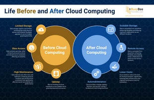
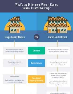
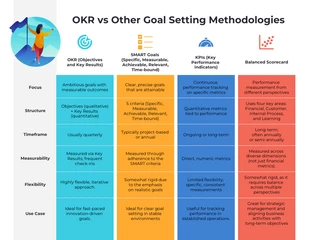
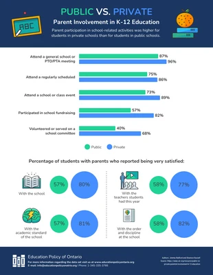
Old vs New Email Open Rate Comparison Infographic Template
Modify this Old vs New Email Open Rate Comparison Infographic Template for a traditional open rate comparison and more
 100% customizable templates
 Millions of photos, icons, charts and graphics
 AI-powered editing features
 Effortlessly share, download, embed and publish
 Easily generate QR codes for your designs
- Design stylemodern
- Colorslight
- SizeLetter (8.5 x 11 in)
- File typePNG, PDF, PowerPoint
- Planfree
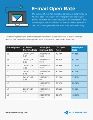
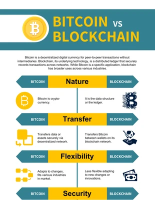
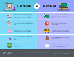
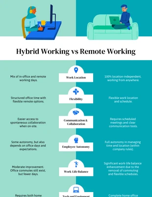
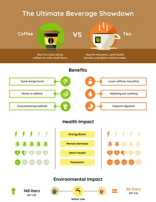
Create a simple open rate comparison infographic and more with this Old vs New Email Open Rate Comparison Infographic Template. You can edit the infographic in no time, including the image, stylish color palette, and large headings. For a basic, yet interesting infographic, insert an image that encompasses the subject. The Venngage gallery is loaded with exceptional images that you can add and adjust the size to suit your needs. When it comes to the colors, use a stylish color palette to keep the Old vs New Email Open Rate Comparison Infographic Template professional. You can either make a color palette of your own, or apply one of Venngage's stylish color schemes. Enter new text and add large headings to make the table easier to read. Merely select the portion of text you want to alter and pick the point size that works for you. Not exactly the comparison infographic you wanted? Search Venngage for more classic infographic templates!