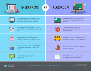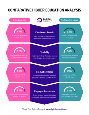
E-learning vs Classroom Comparison Infographic Template
Compose a creative learning comparison and more by modifying this E-learning vs Classroom Comparison Infographic Template
100% customizable templates
Millions of photos, icons, charts and graphics
AI-powered editing features
Effortlessly share, download, embed and publish
Easily generate QR codes for your designs
- Design stylemodern
- Colorslight
- SizeLetter (11 x 8.5 in)
- File typePNG, PDF, PowerPoint
- Planbusiness
Produce an exciting learning comparison and more with this E-learning vs Classroom Comparison Infographic Template. Make it your own by applying a bright color scheme, bold headings, and images. A bright color scheme will immediately capture people's attention and will make the comparison more interesting. Use one of Venngage's automated bright color schemes or create your own color palette from scratch. Next, enter new text and add bold headings to make them pop off the page. You can also use bold headings to highlight important text or to make them more prominent than the body content. When it comes to comparing learning styles, consider utilizing images to communicate each section. You'll find thousands of amazing images in the Venngage gallery that will enhance the E-learning vs Classroom Comparison Infographic Template. Are you looking for more infographics? Check out the Venngage library for more creative comparison infographic templates that are easy to edit!
