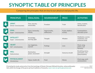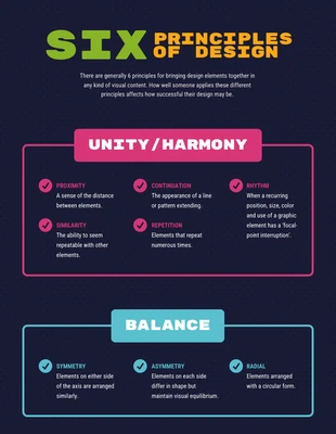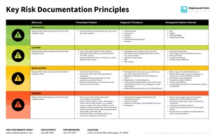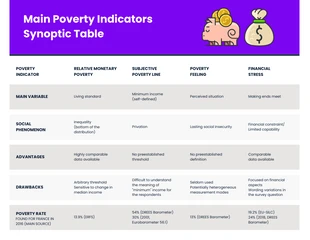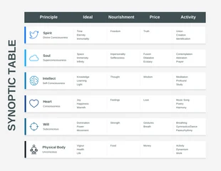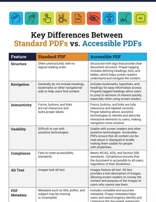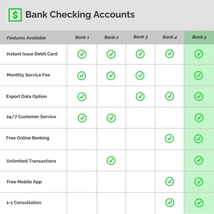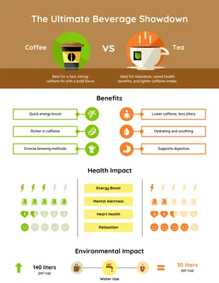
Synoptic Table of Principles Comparison Infographic Template
Compose a conservative principles comparison and more by editing this Synoptic Table of Principles Comparison Infographic Template
100% customizable templates
Millions of photos, icons, charts and graphics
AI-powered editing features
Effortlessly share, download, embed and publish
Easily generate QR codes for your designs
- Design stylevintage
- Colorslight
- SizeLetter (11 x 8.5 in)
- File typePNG, PDF, PowerPoint
- Planfree
Make a clear principles infographic and more with this Synoptic Table of Principles Comparison Infographic Template. Personalize the infographic with icons, a modern color palette, and a subtle font for a fresh design. Start out by adding icons that fit each category on the comparison table. There's thousands of quality icons you can pick from in the Venngage gallery to transform your comparison infographic. As for the colors, opt for a modern color palette so the Synoptic Table of Principles Comparison Infographic Template is eye-catching. Create your own color scheme, or use one of the modern color palettes on Venngage for your comparison infographic. Once you add new text, select a subtle font that's easy to read and keeps the reader's interest. There's an array of subtle fonts on Venngage, but you can choose one of the other font styles that work for your infographic! Not exactly the infographic you wanted? Check out Venngage for more trendy infographic templates!
