Food Waste vs Loss Comparison Infographic Template
Make a creative waste comparison and more by personalizing this Food Waste vs Loss Comparison Infographic Template
100% customizable templates
Millions of photos, icons, charts and graphics
AI-powered editing features
Effortlessly share, download, embed and publish
Easily generate QR codes for your designs
- Design stylemodern
- Colorslight
- SizeLetter (8.5 x 11 in)
- File typePNG, PDF, PowerPoint
- Planfree
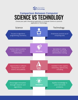
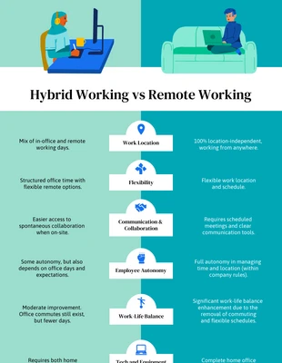
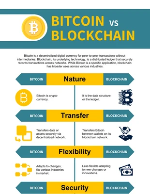
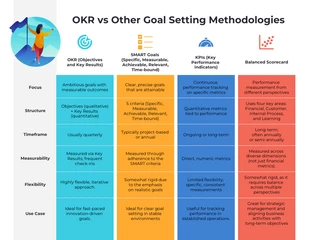
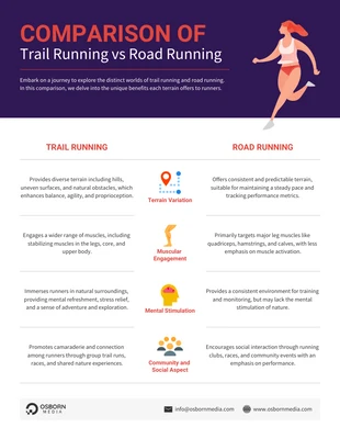
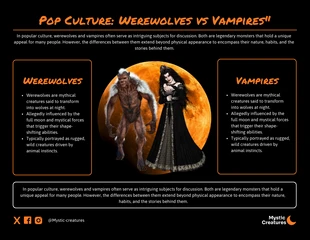
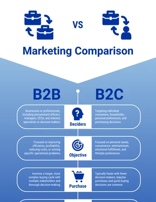
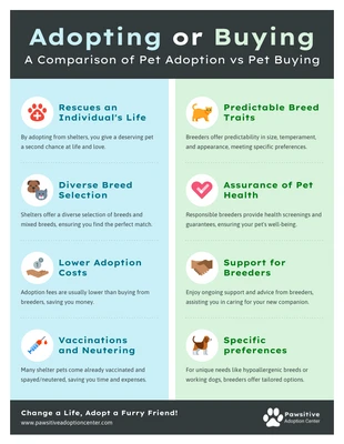
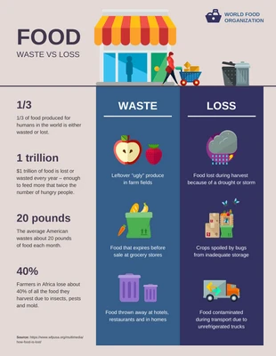
Develop a modern waste comparison and more with this Food Waste vs Loss Comparison Infographic Template. It's fully customizable and features images, bold headings, and a dramatic color palette you can change to make the infographic unique. Start out by adding images that help communicate what your comparison infographic is all about. There's thousands of fantastic images available on Venngage and you can add them where you want and you can adjust their size for more options. Incorporate bold headings to emphasize important statistics and to clearly define each category. Merely highlight the text and select the bold typeface button in the Venngage editor tool to enhance the comparison infographic. Finish the Food Waste vs Loss Comparison Infographic Template by applying a dramatic color palette to grab attention. Choose one of Venngage's pre-generated dramatic color palettes, or opt to make a new one that fits your infographic. Begin customizing the comparison infographic today!
