Crowdfunding Informational Sponsorship Chart Infographic Template
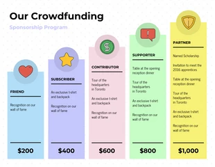
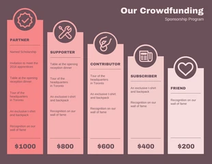
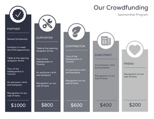
Create informative, data-centric infographics with this easy-to-use sponsorship program infographic template!
100% customizable templates
Millions of photos, icons, charts and graphics
AI-powered editing features
Effortlessly share, download, embed and publish
Easily generate QR codes for your designs
- Design stylemodern
- Colorslight, dark
- SizeLetter (11 x 8.5 in)
- File typePNG, PDF, PowerPoint
- Planbusiness
To use the sponsorship program infographic template, keep in mind the trend or story you wish to get across. Delete, add or resize existing bars, or use new shapes to create a bubble chart or something unique. To get started, access the icon library in the side menu. From the shapes subcategory you can apply squares or circles to create your own simple chart. You can also use the icon library to add eye-catching icons to help your data stand out. Along with the size of your bars or bubbles, apply an overall color gradient to emphasize certain information, demonstrate intensity or importance. With the color picker tool you can change colors or change the opacity for the desired effect. In a few steps you’ll have a compelling chart that tells your story in an engaging and memorable way. Let us know how your design went and if we can help! We want to help you complete each project.
Explore more
- Friends


