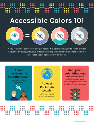
Accessible Colors 101 Infographic Template
Use this color accessibility infographic to educate and help people overcome challenges associated with color blindness. Sign up today at Venngage!
100% customizable templates
Millions of photos, icons, charts and graphics
AI-powered editing features
Effortlessly share, download, embed and publish
Easily generate QR codes for your designs
Accessible and WCAG-compliant
- Design stylemodern
- Colorsvibrant, dark
- SizeCustom (816 x 4550 px)
- File typePNG, PDF, PowerPoint
- Planpremium
Color accessibility infographics are a type of infographic that helps users understand how color can be used to convey information, and how it can be used to create an accessible environment. Color accessibility infographics help users by providing them with the information they need to make decisions about their own or someone else’s color blindness. They also help people understand how colors work together, which is essential for creating accessible environments. The benefits of using color accessibility infographics include: it provides simple, easy-to-understand explanations of color accessibility issues that might otherwise be too complicated or confusing for most people (such as those who are not designers). This helps designers and developers learn more about what kind of impact certain colors have on their audiences, which will help them make better decisions when it comes time to choose colors for their designs/projects. Having little to no prior knowledge of design or layout might be a major hindrance when creating an infographic. Having a template to work off of is quite helpful here. When you sign up with Venngage, you'll have access to thousands
Explore more
- Graphic design
