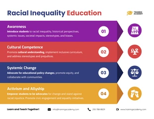
Racism in the US Statistical Infographic Template
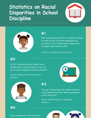
Generate a modern inequality infographic and more by personalizing this Racial Inequality in the US Statistical Infographic Template
100% customizable templates
Millions of photos, icons, charts and graphics
AI-powered editing features
Effortlessly share, download, embed and publish
Easily generate QR codes for your designs
- Design stylemodern
- Colorsvibrant
- SizeCustom (816 x 4800 px)
- File typePNG, PDF, PowerPoint
- Planpremium
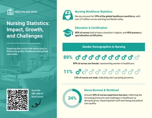
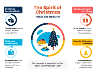
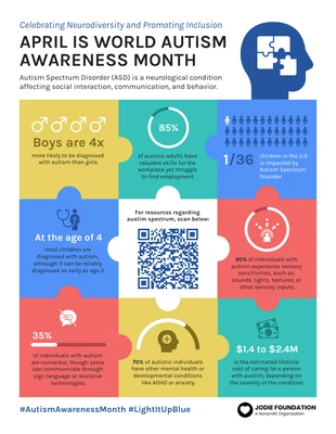
Make a creative statistical infographic and more with this customizable Racial Inequality in the US Statistical Infographic Template. Personalize the infographic with charts, images, and a modern color palette for a unique design. Explain statistics clearly by utilizing a variety of charts in your infographic. Venngage makes it simple and you can upload files through the editor tool and can watch the Racial Inequality in the US Statistical Infographic Template transform. You can also pick the type of chart you want such as pie charts, scatter plots, and bar charts to name a few! Another way you can make your statistical infographic more appealing is by adding images. Venngage has a vast gallery of high-quality stock images you can use to communicate the content of your infographic. Keep the infographic visually eye-catching by applying a modern color palette. There's a wide range of automated modern color palettes on Venngage, or you can make a new one to make your infographic more creative. Get started on your own statistical infographic design today!
