Simple Restaurant Poster Flyer Template
Choose from a number of restaurant flyer templates to design your very own restaurant flyer.
100% customizable templates
Millions of photos, icons, charts and graphics
AI-powered editing features
Effortlessly share, download, embed and publish
Easily generate QR codes for your designs
- Design stylemodern
- Colorsdark
- SizeLetter (8.5 x 11 in)
- File typePNG, PDF, PowerPoint
- Planbusiness
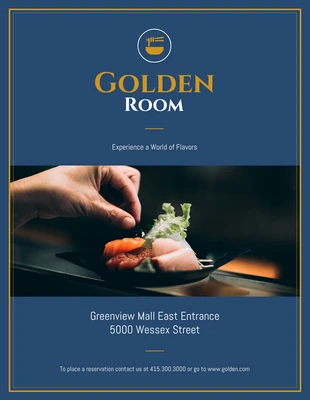
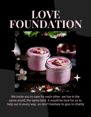
The saying, 'Less is more' certainly applies to this template. In this elegant restaurant flyer template, only the bare essentials are included to create a sense of intrigue for the audience. It's not overly salesy, there are no prices being listed or Tuesday specials that get mentioned. There is only the name of the restaurant, a slogan, an address and contact info with a very subtle call-to-action (CTA). The image of expensive-looking and exotic food really draws people's attention. If you have high-quality photos of food from your establishment, then upload the best one into Venngage and incorporate it into your design. Remember, one perfect image is better than a handful of ordinary ones. The CTA in this template is the call to place reservations. It's not pushy but speaks to the type of establishment this flyer is all about it. Including a similar CTA in your flyer is a great way to make a strong impression and get people to take one more step to interact with you. Deciding on colors can be tricky. A good place to start is to consider
